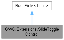
Represents a custom UI component that functions as a toggle control with sliding animation.
Original file from the Unity documentation with only minor compatability modifications made.
More...

Public Member Functions | |
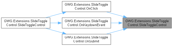
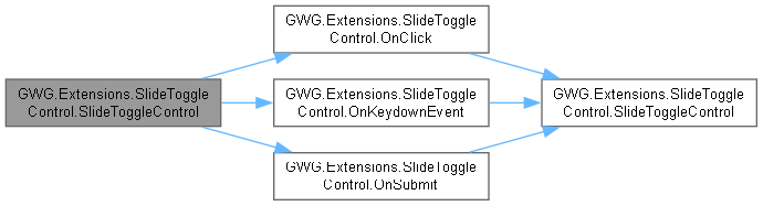
| SlideToggleControl () | |
| Creates A custom UI control representing a Toggle element with a sliding animation but no Label, designed to manage a boolean value in a visually interactive way. | |
| SlideToggleControl (string label) | |
| A custom UI control that visually represents a Toggle element with a sliding animation and Label, It serves as a container for its child control, providing an interactive element for enabling or disabling a boolean value. | |
| override void | SetValueWithoutNotify (bool newValue) |
| Sets the value of the Toggle without triggering a change event notification. This method updates internal state and allows the control to reflect the new value without invoking any event handlers or property change listeners. | |
Private Member Functions | |
| void | ToggleValue () |
| Toggles the current value of the SlideToggleControl between true and false. Updates the visual representation of the toggle to reflect the changed state. | |
Static Private Member Functions | |
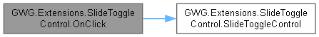
| static void | OnClick (ClickEvent evt) |
| static void | OnKeydownEvent (KeyDownEvent evt) |
| static void | OnSubmit (NavigationSubmitEvent evt) |
Private Attributes | |
| VisualElement | m_Input |
| VisualElement | m_Knob |
| VisualElement | m_Label |
Static Private Attributes | |
| const string | InputCheckedUssClassName = "slide-toggle__input--checked" |
| const string | InputKnobUssClassName = "slide-toggle__input-knob" |
| const string | InputUssClassName = "slide-toggle__input" |
| const string | LabelUssClassName = "slide-toggle__label" |
| const string | USSClassName = "slide-toggle" |
Detailed Description
Represents a custom UI component that functions as a toggle control with sliding animation.
Original file from the Unity documentation with only minor compatability modifications made.
The SlideToggleControl is a specialized Boolean field component derived from the bool class. It provides a visually appealing Toggle functionality and is styled through associated USS classes.
Constructor & Destructor Documentation
◆ SlideToggleControl() [1/2]
|
inline |
Creates A custom UI control representing a Toggle element with a sliding animation but no Label, designed to manage a boolean value in a visually interactive way.
SlideToggleControl is derived from bool and provides a stylized and interactive interface for enabling or disabling a boolean state. It includes a sliding knob and supports input events such as clicking, key presses, and navigation-based submissions, offering a user-friendly functionality. The control is styled through specific USS classes which can be customized further.
◆ SlideToggleControl() [2/2]
|
inline |
A custom UI control that visually represents a Toggle element with a sliding animation and Label, It serves as a container for its child control, providing an interactive element for enabling or disabling a boolean value.
This class derives from bool and is stylized to align content in a flexible and user-friendly manner. Users can activate or deactivate the toggle through multiple input methods: clicking, pressing a key, or submitting navigation input. The control includes custom styling and a knob element to enhance visualization.
Member Function Documentation
◆ OnClick()
|
inlinestaticprivate |

◆ OnKeydownEvent()
|
inlinestaticprivate |
◆ OnSubmit()
|
inlinestaticprivate |

◆ SetValueWithoutNotify()
|
inline |
Sets the value of the Toggle without triggering a change event notification. This method updates internal state and allows the control to reflect the new value without invoking any event handlers or property change listeners.
- Parameters
-
newValue The new value to be set for the toggle element.
◆ ToggleValue()
|
inlineprivate |
Toggles the current value of the SlideToggleControl between true and false. Updates the visual representation of the toggle to reflect the changed state.
This method is used internally by event handlers such as ClickEvent, KeyDownEvent, and NavigationSubmitEvent to alter the toggle state in response to user interactions. It flips the boolean value and adjusts the toggle's appearance accordingly.
Member Data Documentation
◆ InputCheckedUssClassName
|
staticprivate |
◆ InputKnobUssClassName
|
staticprivate |
◆ InputUssClassName
|
staticprivate |
◆ LabelUssClassName
|
staticprivate |
◆ m_Input
|
private |
◆ m_Knob
|
private |
◆ m_Label
|
private |
◆ USSClassName
|
staticprivate |