Give players more ways to make your interface their own—without giving them control over your application code or styling rules.
Developer Extensions connect application-owned appearance settings to Theme Studio and player themes. A declaration supplies an identity, type, default and constraints; application rules say where to apply the value; your control supplies the matching structure.
This guide uses the existing Demo hotbar, ToolbarWindowExample, throughout. Its example.hotbar declarations and application rules are already supplied. You do not need to create another demonstration extension to follow the guide.
Required Setup
- Use the existing Demo repository, or your project-owned copy of the example, with a configured modern theme.
- Keep the hotbar application stylesheet in Shared Stylesheets > Additional Application Rules.
- Use the existing marked WFWDevExt declarations in the selected theme's settings USS; do not duplicate them in another file.
- Keep the actual ToolbarWindowExample type, its frame class, child classes and action IDs when inspecting the supplied example.
- Save source changes and prepare the selected 2.0 theme values before offering them through player themes.
1. Understand What the Demo Demonstrates
The hotbar is a headerless, locked, bottom-positioned WindowFrame containing twelve placeholder slots. Three slots open the Demo, Settings and Help interfaces; the remaining slots demonstrate layout and appearance, not an implemented gameplay inventory or drag-and-drop system.
Its extension exposes independent dimensions, spacing, colors and three image choices. Changing those settings does not require changing slot construction or adding another theme controller.
For your own control, reusing an existing framework color needs only an application rule consuming that token. Declare a Developer Extension when you want a new independent supported Studio/player setting. The Demo shows how that connection is authored—not a requirement that every custom control becomes a hotbar.
2. Keep Identity, Variables, Classes and Type Separate
For the hotbar width:
- Metadata identity: example.hotbar.width.
- Namespace: example.hotbar, used for the Studio group and player JSON section.
- Key: width within that section.
- USS variable: --demo-hotbar-width.
- Type/selector scope: ToolbarWindowExample.windowFrame.
The identity splits at its final dot. Neither example.hotbar.width nor --demo-hotbar-width is an AddToClassList argument.
The hotbar's child classes are demo-hotbar-content and demo-hotbar-slot. They are written without a leading dot in C#/UXML. Their application selectors also require the ToolbarWindowExample.windowFrame ancestor; assigning a slot class to an unrelated control does not satisfy that selector.
3. Open the Existing Files
The example is connected through these supplied files:
- Declarations/defaults: Assets/GarageWareGames/WIndowFramework/Resources/WindowFramework/Themes/v2.0/DefaultTheme2/WFW.DefaultTheme2.uss, inside its marked Developer section. Other supplied modern theme settings carry the corresponding example declarations for their own look.
- Application rules: Assets/GarageWareGames/WIndowFramework/Demo/Resources/WindowFramework/Demo/DevExtensionsHotbarDemo.uss.
- Control construction/actions: Assets/GarageWareGames/WIndowFramework/Demo/Scripts/WindowExamples/ToolbarWindowExample.cs.
- Collection configuration: the ThemeData used by the Demo/controller, with the application-rule reference and selected theme entry.
The settings file owns the defaults. The application file consumes them. The C# class constructs the content and wires the Demo actions. Preparation derives records from those inputs; it does not create another authored settings asset.
The excerpts below already exist. Inspect them in your selected theme and the application file rather than pasting duplicates into the same source graph. When adapting the pattern for your own application, use your own identities, variables, type/classes and actions. See Stylesheet Setup and Theme Structure for file ownership and registration.
4. Read the Existing Annotations
These number, color and image declarations illustrate the existing hotbar metadata. They are excerpts from its marked section, not a replacement for all the other settings in that file:
/* WFW:BEGIN DEVELOPER */
ToolbarWindowExample.windowFrame {
    /*
    WFWDevExt: example.hotbar.width
    type: number
    unit: px
    min-exclusive: 0
    max: 4096
    label: Hotbar width
    description: Overall fixed frame width in pixels.
    */
    --demo-hotbar-width: 686px;

    /*
    WFWDevExt: example.hotbar.slotColor
    type: color
    label: Slot color
    description: Normal background color of all hotbar slots.
    */
    --demo-hotbar-slot-color: #808080FF;

    /*
    WFWDevExt: example.hotbar.demoImage
    type: image
    label: Demo action image
    description: Image displayed in the hotbar action that opens the Demo window.
    */
    --demo-hotbar-demo-image: resource("WindowFramework/Demo/images/demo");
}
/* WFW:END DEVELOPER */
The metadata comment must immediately precede its declaration inside the marked Developer section. Every metadata field occupies its own line; commas do not separate metadata fields. LF/CRLF and ordinary comment-star decoration are accepted.
The declaration owns the default; the annotation owns identity, type, optional editor text and constraints. Consumer rules do not redefine those defaults. These variables are scoped to the toolbar and inherited by its descendants, rather than being a second global palette.
Identity and Variable Rules
- Use a lowercase dotted namespace with at least two segments, such as example.hotbar, up to 100 characters.
- The namespace begins with a lowercase letter; supported characters are lowercase letters, digits, underscores, hyphens and dot separators.
- The final key starts with a letter and uses letters, digits, underscores or hyphens, up to 80 characters. Keys are case-sensitive; slotWidth is not slotwidth.
- A variable starts with -- and uses 1–100 letters, digits, underscores or hyphens after that prefix.
- Do not annotate framework-owned --wfw-* variables.
- Keep identities unique. Repeated annotated identities warn and keep the first definition; they are not a later-default override mechanism.
Changing an identity changes which player JSON key matches it. Preserve the current example's spelling while following it.
5. Follow the Existing Application Rules and Structure
The supplied application USS consumes the hotbar values at three levels:
- The frame rule uses the width/height constraints, frame background, border width and radius.
- The named content wrapper and demo-hotbar-content container use the content background and layout; the latter consumes padding.
- Each demo-hotbar-slot consumes slot dimensions, margin, background, border color/width and radius. A hover rule consumes the separate hover color.
For example, the existing slot and hover rules are:
The C# constructor creates a container with demo-hotbar-content, adds twelve elements with demo-hotbar-slot, then assigns that container to the frame's Content. It renames the three action slots to HotbarDemo, HotbarSettings and HotbarHelp. The application USS uses those IDs to apply the respective image settings.
For example, ToolbarWindowExample.windowFrame #HotbarDemo consumes --demo-hotbar-demo-image. The resource path is the authored default; a player override later supplies a contained image path, not a project URL or C# selector.
The class strings, type selector and IDs are three different matching mechanisms. Do not add ToolbarWindowExample as a class to impersonate the type, or expect a lone demo-hotbar-slot outside the toolbar to match the scoped rule.
The Demo control owns construction, actions, tooltips, locking and starting placement. The extension owns supported appearance values. Mounting and DemoControl callback prerequisites remain the existing Demo setup; this guide does not introduce a second host or another sample control.
Existing Hotbar Settings
The supplied declarations cover these exact keys:
- Dimensions: width, height, slotWidth, slotHeight.
- Spacing/geometry: padding, margin, slotBorderWidth, radius, border-width, border-radius.
- Colors: frameColor, contentColor, slotColor, borderColor, hoverColor.
- Images: demoImage, settingsImage, helpImage.
The two hyphenated border keys describe the outer hotbar window; slotBorderWidth/radius describe the slots. The authored numeric bounds are positive for dimensions and nonnegative for the listed spacing/border/radius values, with inclusive maximum 4096. Choose practical player values even when the processor accepts a larger range.
6. Choose a Supported Value Type
Numbers
Use type: number, unit: px, exactly one lower-bound field, and an inclusive max:
- min: inclusive lower bound; min: 0 permits zero.
- min-exclusive: exclusive lower bound; min-exclusive: 0 requires a positive value.
- max: inclusive upper bound.
Bounds must be finite decimal numbers within the processor's supported -4096 to 4096 range, and the range must not be empty. The default must satisfy the same limits. Choose practical bounds for your control rather than automatically using the largest possible range.
Pixel defaults use values such as 12px; unitless zero is also accepted. Percentages, seconds, auto, calculations and arbitrary unit strings are not numeric extension values. Choose positive dimension limits where zero would make the interface unusable. Negative spacing should be used only where the target geometry permits it, such as margins.
The player JSON value is a JSON number, such as 24, not "24px" or "24".
Colors
Use type: color. Prefer an explicit #RRGGBB or #RRGGBBAA authored default, a supported named color, or supported rgb/rgba notation. Resolvable aliases to existing theme colors are also supported; the existing hotbar slot example uses an explicit hexadecimal default.
Prepared/player color values are normalized hexadecimal strings. Alpha is supported. Do not add numeric units or min/max fields to a color declaration.
Images
Use type: image. The authored default is none or a supported local resource(...)/url(...) reference to Texture2D artwork in a runtime Resources folder.
Developer image settings use the existing raster pipeline. Framework support for some compiled VectorImage references does not make a developer image declaration accept arbitrary SVG/vector files.
Use unambiguous Resources-relative references without file extensions where that syntax is used. Imported player images use validated relative PNG/JPG/JPEG paths inside the player theme folder; players do not supply project URLs, absolute paths, traversal, or source asset GUIDs. A JSON null image value means explicitly no image; an omitted image key uses the configured default.
Saving a Developer image field updates a reference. It does not recolor, replace, or silently duplicate the artwork. Folder copying and player-copy staging are separate operations with their own reference boundaries.
Labels and Descriptions
label and description are optional authoring text. Studio falls back to the key when a label is absent. They are not player overrides or permissions.
Labels are bounded to 160 characters and descriptions to 2048 characters. Metadata is line-based, so keep each field on one line. Unsupported or duplicate metadata fields are errors; a complete metadata comment is bounded to 4096 characters.
7. Use Supported Property and Selector Mappings
A setting can appear in Studio/export even when no portable application rule was prepared. Seeing the field is not proof that a player override reaches your control. Check preparation diagnostics and the actual consumer rule.
Properties
The current mapping vocabulary includes:
- background-color, color, and background-image.
- width, height, min-width, min-height, max-width, and max-height.
- Individual padding-* and margin-* edges.
- Individual border-*-width and border-*-color edges.
- Individual corner-radius properties such as border-top-left-radius.
- Supported one-to-four-value expansion of padding, margin, border-width, border-color, and border-radius.
Use the setting type appropriate for the target. A color declaration consumed by a width property does not become a valid numeric mapping. The compiler reports incompatible consumers while retaining the exported setting.
Start each mapped value with a supported var(...) reference. The mapping reader processes that reference, not a general expression engine. Arbitrary calc, transform, opacity, font, cursor, layout-mode, and compound-expression properties are outside this developer mapping vocabulary. Ordinary Unity USS remains its own styling system; unsupported consumers are not rewritten to become portable.
Selectors and States
Supported matching includes simple type, class, ID and universal selectors, compound combinations, descendant/child relations, and these states:
hover, active, focus, disabled, enabled, checked, and root.
Type matching uses the actual type's short name and its base types. IDs match element names. Classes match the class list. Prepared :root matching refers to the binding's explicit scope. Checked state is meaningful on actual Toggle controls.
Sibling combinators, attribute selectors, unsupported pseudo-classes and arbitrary CSS syntax are not portable developer selectors. A comma-separated selector list is processed as individual authored selector targets. Unsupported selector consumers warn and remain unmapped; that does not erase the annotation or certify how ordinary USS renders them.
Keep the required ancestors within the binding scope. ToolbarWindowExample.windowFrame .demo-hotbar-slot requires the slot to be beneath the actual toolbar type with its frame class; a class on a different standalone control is not enough.
8. Edit in Studio and Save the Source
Open the existing Demo repository or your project-owned copy and select the modern theme containing the hotbar declarations. Expand Developer Extensions, then example.hotbar.
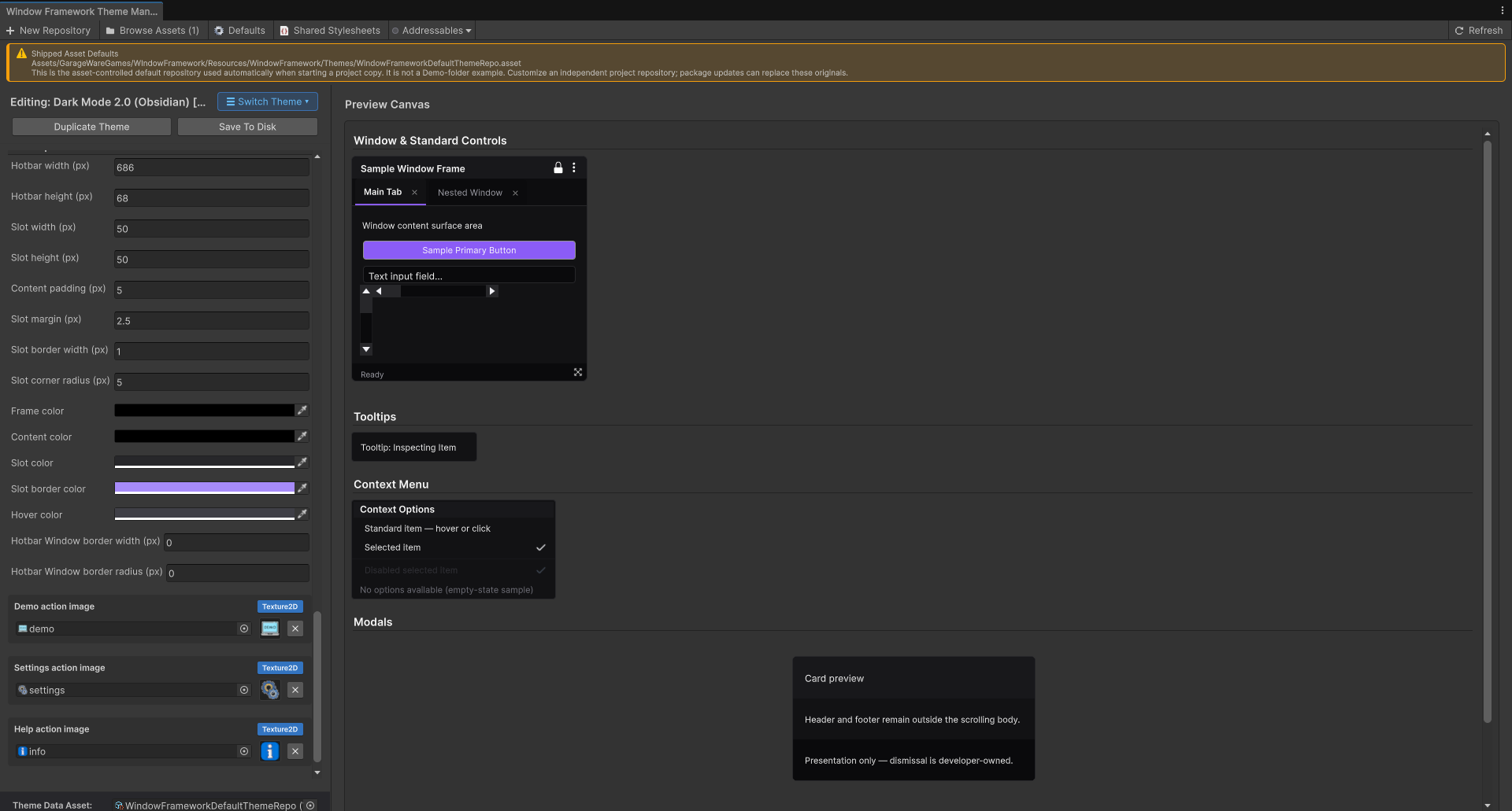
Studio reads the same metadata used by preparation. It shows number, color or raster-image controls with the authored labels, descriptions, units and source information. If nothing valid was discovered, the area can show None installed.
Edit the intended fields and choose Save To Disk. Only explicitly edited developer values are replaced at their original declaring source/scope; metadata headers, selectors and unrelated values are preserved. Assets-based editable source is required for Studio writes. It does not move a scoped declaration into :root or create another defaults store to make a read-only file editable.
A linked default initially displays its resolved value. Saving an explicit edit replaces that declaration's value; this is not a permanent automatic reset link. Reestablish an authored alias in the source when that is your intended default policy.
Save before changing editing selection or preparing. Check Theme Studio and Manager for the matching TSS/USS save target and the difference between source edits, collection metadata, and runtime active/default roles.
9. Prepare the Theme for Player Use
In Switch Theme, choose Prepare Selected 2.0 Theme Values after saving the selected source. Preparation reads the actual application/settings imports, extracts metadata, resolves defaults, and retains supported rule targets in that theme's snapshot.
For the hotbar, check the declared keys listed above and their consumer targets: toolbar geometry, content padding, slot geometry/colors, hover color and the three named action images. A missing hotbar application-sheet reference can leave the settings exportable but with no rule applying them.
Prepare the default theme used as the player's baseline and any other built-in themes offered through copy workflows.Source changes, referenced assets, metadata constraints and application rule changes can make previous preparation stale; refresh it before relying on a build/copy workflow.
Prepared DeveloperThemeDefinition records are derived output, not data assets you author by hand. The normal player-theme runtime creates their adapters from the selected baseline snapshot. Do not manually register a second handler with the same namespace as a metadata-generated definition; that is a registry conflict.
10. What Players Can Edit
In the player's theme.json, the extension values appear under their namespace:
This changes the existing hotbar width and normal slot color and explicitly removes its Demo action image. Omitted keys retain their configured defaults. This is an extension fragment, not a complete theme manifest.Keep the framework's identity/name/version fields and any other required data around it. The player-copy workflow supplies that surrounding structure.
- The player changes values, not class names, selectors, types, defaults, numeric bounds, or label/description metadata.
- Missing keys use the configured prepared defaults. Supported framework-linked defaults can use the active framework value when appropriate and within constraints.
- Invalid typed/out-of-range values in a known generated section can be omitted with an issue report and default recovery.
- Unknown keys in a known generated namespace reject that section/theme; an unsafe image path is also a blocking error.
- Unknown unregistered namespaces remain opaque data, are ignored for application, and can be retained during export. They do not execute a new handler.
Reload through the existing Refresh workflow and use explicit selection to apply a different theme. This system does not poll player files every frame or apply arbitrary stylesheet text from their folder.
See Player Themes for copy creation, folder layout, images, runtime selection, and recovery messages.
11. Account for Runtime Ownership and Dynamic UI
Ordinary built-in themes use their authored USS. Selected player themes apply prepared developer values through bounded property bindings within the supplied scopes.Those bindings can write inline properties and therefore affect precedence relative to ordinary USS, including state styling.
Build your application content and assign its classes before binding where practical. Attach/detach paths participate in reconciliation. When your owner changes the hierarchy or matching classes while a theme is active, use the existing PlayerThemeRuntime.RefreshControls() integration after the change; geometry changes alone are not the discovery mechanism.
Keep using the controller's existing runtime owner rather than starting an unrelated second theme manager for the same controls. Theme switching and scope release dispose the owned bindings before imported textures/folders are released. Newer application-owned writes have their own precedence/restoration implications; do not treat theme selection as authorization to overwrite every inline property.
The bindings do not provide gameplay permissions, arbitrary property setters, font imports, animation authoring, or identical rendering for every unannotated USS rule. Test your supported states, layout, images and application ownership in the actual runtime.
12. Diagnose the Complete Connection
If the field does not appear in Studio:
- Check that the declaring file is in the selected theme's configured source/import graph.
- Check both Developer section markers and the annotation's immediate position before its declaration.
- Check namespace/key spelling, metadata line breaks, type and numeric constraints.
- Check that the variable is your own non---wfw-* custom property.
- Read the source-specific metadata diagnostic instead of adding duplicate declarations elsewhere.
If the field appears but the control does not change:
- Confirm the application USS is registered in the correct collection.
- Confirm its supported property consumes the declared variable and the annotation default resolves.
- Check exact class spelling, actual type/ID, state, ancestor structure and binding scope.
- Save and prepare the intended theme; a Studio field alone is not a prepared target.
- Check explicit theme selection and dynamic-control reconciliation.
- Check competing/inline properties and test both the authored theme and selected player theme.
If an image fails, check runtime Resources placement, Texture2D type, reference uniqueness and the contained player image path. If saving fails after external source edits, reload/reconcile that source rather than overwriting another author's changes.
Supported Processing Limits
The current prepared contract bounds developer data to 128 settings total, up to 32 namespaces, and up to 8192 prepared rules per definition. The source reader also bounds rule/declaration counts and alias depth. These are processing limits, not recommended form sizes; design smaller, purposeful groups that players can understand.
Before Publishing the Customization
Verify the whole chain—not just a successful import:
- Each intended setting has one valid declaration/default and appropriate constraints.
- The correct typed fields appear in the intended Studio namespace.
- Saved edits update the original source without changing unrelated declarations.
- Preparation includes the settings and their supported application targets.
- Class/hierarchy matching works for your actual controls in the intended scope.
- A player copy contains the correct namespace/key values and supported images.
- Valid overrides change the control; missing/recovered values use the intended defaults.
- Unsafe paths/unknown known-section keys fail safely with useful reports.
- Dynamic controls, theme switching, state changes and cleanup work in your application.
The same declaration powers authoring and supported player customization, but the application must still supply a usable control and a valid configuration. Continue to Player Themes for the player-facing workflow, or Stylesheet Setup and Theme Structure and Built-in Styling Class Reference when you need to check the files and selector roles.
