Give your interface a visual identity without rebuilding its window content for every look.
Theme Studio brings the theme collection, appearance controls, and a representative preview together in one editor workspace. Start from a project-owned theme, adjust the surfaces and typography, refine component details, and save the result back to its source files.
This page covers the authoring workflow. Stylesheet Setup and Theme Structure explains the underlying files and scope; Built-in Styling Class Reference lists actual reusable roles and component classes for your custom UI.
Before You Begin
- Complete Installation and Setup and work in your own theme repository, not the installed asset defaults.
- Use a configured 2.0 theme for modern editing and preview. Legacy entries use the upgrade workflow described below.
- Keep the essential application stylesheets configured. Theme settings supply values; those rules apply them to the interface.
- Save token edits before changing the theme you are editing. Selecting another theme reloads its authored values into the inspector.
The Authoring Workflow
1. Open the Right Repository
Choose Tools > Garage-Ware Games > Window Framework > Theme Manager.
Open your project ThemeData through the repository browser or the manager's asset selection. The ThemeData Inspector also provides an Open Theme Manager Window launcher, but that button preserves the manager's selected repository; it does not automatically switch to the asset you were inspecting.
Use the repository name and the pinned ThemeData field to confirm where you are working. Project repositories, shipped defaults, and Demo examples have different purposes. For your application, create the project-owned setup through Installation and Setup before customizing its theme files.
2. Get Comfortable With the Workspace
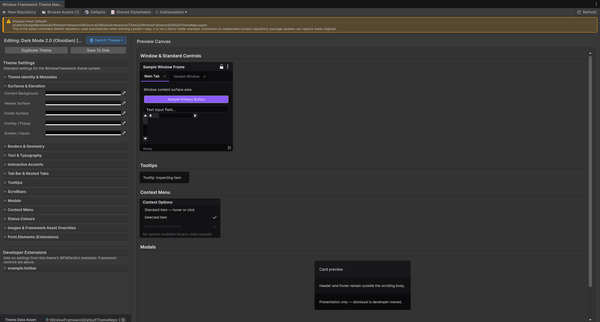
- Theme Token Inspector: the selected theme's identity and grouped appearance fields. Expand only the groups you need.
- Switch Theme: opens the Theme Master List drawer for editing selection, collection actions, and player-theme preparation options.
- Preview Canvas: representative window, tab, tooltip, control, menu, modal, and status samples. Scroll to review different components.
- Action bar: offers Duplicate Theme and Save To Disk for compatible modern themes, or the legacy upgrade action when appropriate.
- Pinned ThemeData field: identifies the collection behind the Studio view.
The split view lets you adjust the space allocated to the inspector and preview. Expanding a group or scrolling changes the editor workspace, not your theme values.
The preview helps you evaluate supported appearance settings. It is not your application's scene and does not reproduce every custom selector, inline style, input interaction, or gameplay condition. Test your actual interface after authoring.
3. Editing, Active, and Default Are Different
Click Switch Theme to open the Theme Master List.
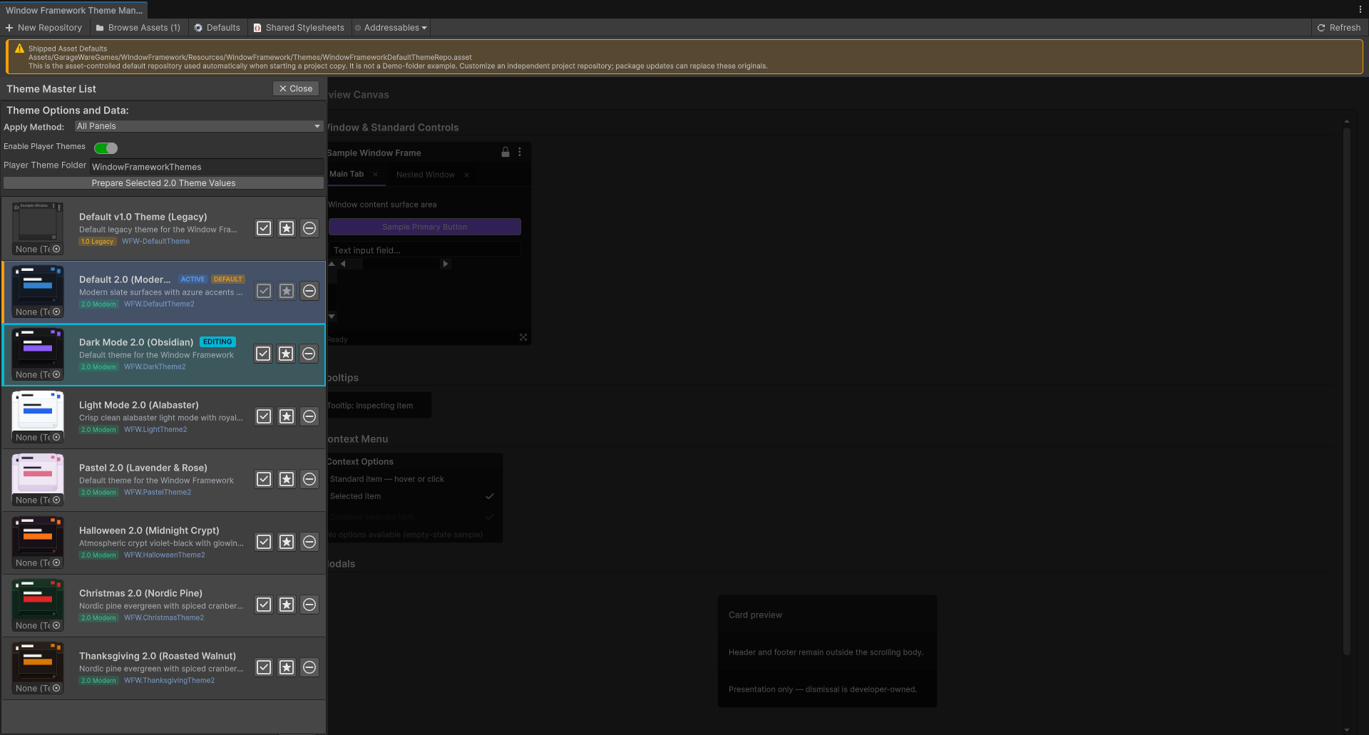
- EDITING: the row loaded into Studio's fields and preview. Studio remembers this editor selection across window rebuilds when the collection is an asset.
- ACTIVE: the collection's current active selection. Use the row's Set Active action when that is the role you intend to change.
- DEFAULT: the configured fallback/default theme. Use Set Default deliberately; do not assume that selecting or editing a row changes the default.
A theme can have more than one badge because these are separate roles. The active/default actions update collection configuration; a row click simply chooses what you are editing.
Theme application scope is also a collection choice. Window Frames Only, Parent Panel, and All Panels determine where the configured composition reaches the UI. See Make Sure the Theme Reaches the Control before applying a theme broadly to an existing interface.
4. Start With an Existing Theme or an Independent Copy
For a straightforward first workflow, open a valid 2.0 theme from your project repository and choose Duplicate Theme.
Duplication copies the saved, owned theme folder, including supported nested source and preview assets, then registers a new independent entry with its own identity. Shared application rules remain collection-owned. The copy is not automatically the default theme.
Save before duplicating if you want your latest token edits included.** Duplicate reads authored source, not a snapshot of unsaved inspector colors and sliders.
A destination conflict offers a separately named copy or cancellation, not overwrite. If the source has appearance imports outside its owned folder that prevent an independent copy, the workflow reports the problem instead of silently flattening them. External artwork references outside the source boundary remain shared when the copy workflow retains them.
The + control in the master list adds a blank theme entry. It does not create a complete TSS/USS folder or fill in every required value. Assign an appropriate configured theme sheet to that entry, or use duplication when you want a ready-to-edit starting point. Creating a repository is a different operation from adding a theme row.
5. Set Identity and Preview Artwork
Under Theme Identity & Metadata:
- Theme Name is the display name in the collection and inspector. Changing it does not rename the theme files or create a new stable theme identity.
- Description explains the look to users browsing the collection.
- Theme Sheet (.tss) is the theme entry's stylesheet reference. Reassigning it changes which source the entry points to; it does not copy or convert that source.
- Theme preview image is the collection/list artwork. Choose the supported texture or vector image type and asset.
This preview artwork is separate from the Window Background and Default Theme Indicator settings. A thumbnail, a window wallpaper, and a default marker serve different purposes.
Metadata controls update the collection entry and mark the asset dirty. Appearance-token controls drive the preview until saved through Save To Disk. Collection actions and options can have their own immediate save paths, so switching themes is not a universal undo operation for every kind of edit.
6. Shape the Shared Appearance
Work from broad visual decisions toward specific component details:
- Surfaces & Elevation: content, header, footer, overlay/popup, and sunken/input backgrounds.
- Borders & Geometry: border color, width, and window corner radius.
- Text & Typography: primary, secondary, accent text, font reference, and title/body/caption sizes.
- Interactive Accents: default, hover, and active accent values.
- Tab Bar & Nested Tabs: tab-strip size, backgrounds, and active border.
- Tooltips: background, text, and border appearance.
- Status Colours: success, warning, error, info, and supported error-surface/validation values.
Choose readable contrasts for normal, hovered, selected, and disabled controls. Check the smaller text samples as well as titles; a theme that looks attractive in a large heading may be difficult to use in a dense form.
These are theme values, not automatically reusable classes for each setting. Content Background, for example, can be used by your own application rule with var(--wfw-surface-background). Changing that value does not create a class to assign to a control. See 5. Theme Your Own Control for the practical custom-control pattern.
7. Keep Component Values Linked—or Override Them
Expand Scrollbars, Modals, Context Menu, or the supported extension-control group to refine component settings.
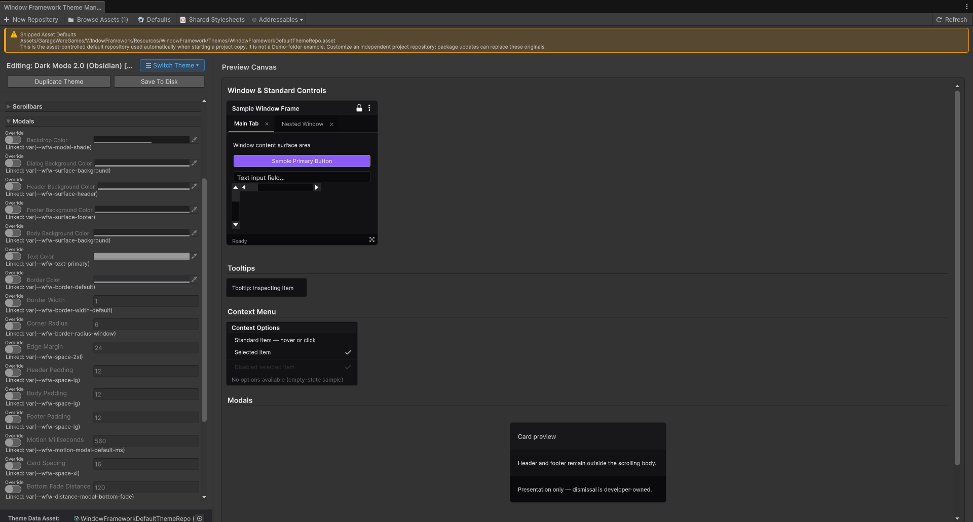
A line such as Linked: var(--wfw-surface-background) means that the component value currently follows another authored setting. The field is read-only until you enable Override for that supported linked row.
- Leave Override off to keep the link and let the shared setting drive the component.
- Enable Override to edit an independent component value in the current theme.
- Turn Override off again to return that row to its linked expression when it has a supported stored reference.
Rows authored as independent values do not have a linked-variable description; the variable area remains blank. Override availability is based on the authored mode, not a promise that every literal field can invent a new link. After saving an explicit value and reloading, that row is authored as independent; Studio does not retain the old link as a permanent automatic reset target.
For example, keeping a modal body linked to Content Background gives the two a coordinated appearance.Overriding that component value lets the modal body differ without changing every consumer of Content Background.
The linked text is an explanation of the source value. It is not a USS class name or an AddToClassList argument. Studio does not infer a reusable class from whichever component selector happens to consume a value.
8. Assign Images, Icons, and Cursors
Under Images & Framework Asset Overrides, choose supported artwork for window backgrounds, lock/options/resize icons, context-menu checkmarks, default markers, warnings, and cursors.
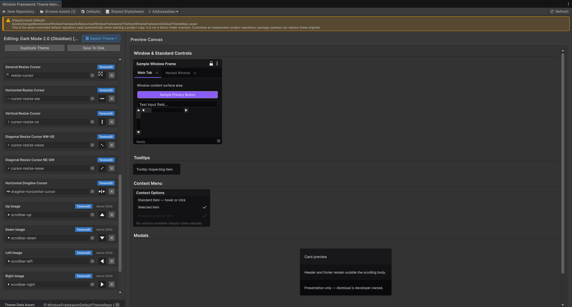
The asset rows provide the appropriate type choice, object field, thumbnail, and clear action. Where available, choose Texture2D or VectorImage; cursor rows and developer image settings use their supported raster restrictions rather than accepting every image type.
Assets assigned through Studio's resource-validating pickers must be project assets under a suitable Resources folder. Resource expressions use a Resources-relative path without the extension. A folder's location and spelling therefore matter; an arbitrary asset elsewhere under Assets does not make a resource path valid.
Clearing an optional value writes the supported empty/none reference. It does not delete the source image. Save To Disk preserves image files and updates the relevant source/reference metadata; it is not a background-removal, recoloring, or artwork-generation tool.
Test vector artwork, cursor hotspot behavior, contrast, and scaling in your target application. A visible editor thumbnail is not proof of identical runtime rendering on every platform.
9. Use Developer Extensions for Your Own Settings
The Developer Extensions area groups installed WFWDevExt declarations by namespace. Fields are generated from their declared number, color, or image type, authoring text, and supported constraints.
An empty area can display None installed. That means no valid declarations were discovered in the configured source graph; it does not mean you must register every custom control just to reuse an existing framework color.
- Reuse an existing value: write an application rule consuming that token. No new Studio setting is required.
- Expose a new independent setting: declare its metadata/default and supported application consumer so Studio and player themes can use it.
Developer fields write explicitly changed values back to their original declarations. Their source path is included in the field tooltip. Asset source under your project can be edited through the supported workflow; read-only or unavailable sources are not silently copied into a second settings store.
See Stylesheet Setup and Theme Structure for file ownership, and Developer Extensions for the complete declaration/application workflow. Studio is not a general inspector for every arbitrary USS property.
10. Save the Authored Result
Choose Save To Disk after reviewing the theme.
The save workflow expects the selected TSS to have a matching USS file beside it with the same base filename. The existing creation/duplication workflow supplies this pairing. Keep the pair intact when managing files yourself; a TSS reference alone is not proof that its expected save target exists.
Saving updates supported framework settings and explicitly edited developer declarations at their original source/scope. It preserves unrelated developer selectors, metadata headers, and values rather than replacing the entire source with the preview's appearance.
Successful saving imports the changed sources, saves the collection's supported preview references, and reloads the selected theme into Studio. If a save is blocked by missing source, invalid developer values, or a source change that conflicts with the loaded developer edits, read the diagnostic before retrying. Do not overwrite another author's work to dismiss that warning.
Check the saved theme in your actual UI. The Preview Canvas is representative; custom rules, local inline overrides, panel scale, fonts, and runtime interactions may still affect the application result.
11. Prepare Values When Offering Player Themes
In Switch Theme, the master list provides:
- Enable Player Themes: opt in to the player-theme system.
- Player Theme Folder: a single local folder name beneath Application.persistentDataPath, not an Assets installation path.
- Prepare Selected 2.0 Theme Values: prepare the supported values for the theme currently selected for editing.
Save your source before preparing so the snapshot represents the intended authored theme. The preparation control reads the configured collection/application graph and stores the prepared snapshot on that theme entry. It does not save unsaved token-control edits for you, create a player theme copy, or prove every custom styling rule can be reproduced in a player theme.
Preparation and saving are distinct actions. Upgrade legacy entries before portable preparation. Keep a compatible prepared default configured if player-copy workflows depend on it, and prepare the themes your application offers through those workflows.
Review the preparation message, then verify runtime selection, editable-copy creation, and supported player overrides through Player Themes. Arbitrary player CSS, code, or selector changes are not enabled by preparing values.
12. Upgrade Legacy Themes and Remove Entries Carefully
Legacy 1.0 themes do not use the modern Studio preview. Their view displays a compatibility notice and Upgrade to 2.0 actions.
Upgrade creates separate modern output from the selected legacy source rather than changing that original theme in place. Review the output and its preparation result before using it. This is an appearance upgrade workflow, not guaranteed automatic conversion of every custom layout or unmarked rule.
The master list's remove action confirms removal of a theme entry. It leaves its source stylesheets and image files on disk and keeps at least one collection entry. If removing the configured default, deliberately check the remaining default/active configuration afterward; removal is not automatic default-theme design.
Before You Offer the Theme
- Confirm you edited and saved the intended project theme, not a shipped default.
- Check normal, hovered, active, disabled, and validation appearances.
- Review window, tab, menu, tooltip, modal, and form samples.
- Test text, images, vector assets, and sizing in the real application.
- Confirm the application stylesheet references and theme scope.
- Choose active/default roles deliberately rather than relying on editing selection.
- If enabling player themes, prepare the intended values and test the supported runtime workflow.
Continue to Developer Extensions for custom editable settings, Player Themes for player customization, or Troubleshooting for configuration problems. The advanced stylesheet guides remain available whenever you need to understand which file or selector owns the result.
