Let players make the interface their own without opening Unity or changing your application code.
Player Themes provide independently editable JSON/image folders, runtime discovery and selection, and useful reports when a value or file needs attention. They build on your configured themes and supported Developer Extensions. You control the available settings, font references, application targets, and validation boundaries.
This guide covers developer setup and the player's copy/edit/select workflow. It uses the existing settings controls and the existing example.hotbar Demo extension—not another demonstration control or theme system.
Required Developer Setup
- Complete Installation and Setup with the intended controller, UI document, theme data and application rules.
- Configure unique built-in theme identities and exactly one intended default theme.
- Save and prepare the compatible 2.0 themes offered through player-copy workflows, including the default used as an imported theme's baseline.
- Enable Player Themes on the collection and choose its local folder name before the runtime session starts.
- Keep custom controls within the configured theme/application scopes; declare supported Developer Extensions when you need new independent settings.
The controller initializes the existing selection owner during startup after its root/configuration is available. Configured Addressables hydration can defer that initialization; see Optional: Addressables Theme Loading. Creating a settings form alone does not initialize the controller or create a player copy.
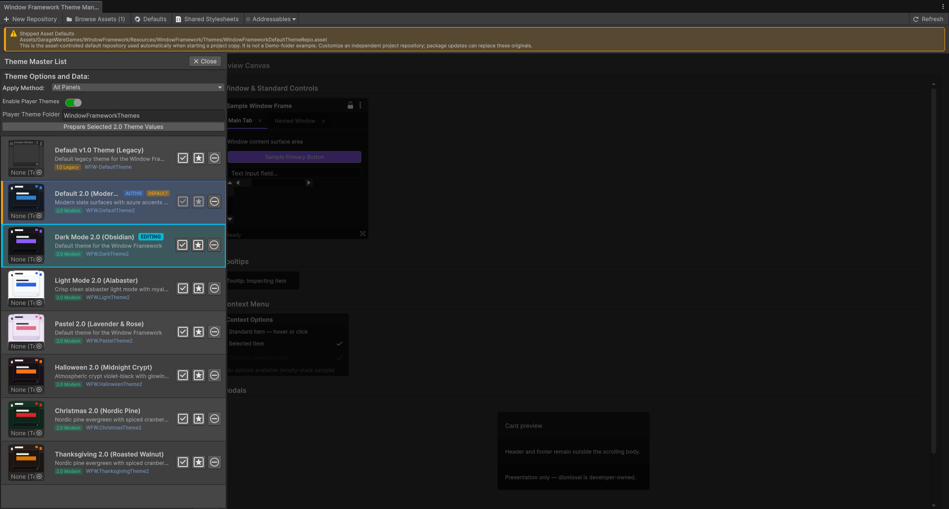
Use 11. Prepare Values When Offering Player Themes for the preparation controls and 9. Prepare the Theme for Player Use for custom settings. Do not create a second owner for the same UI just to enable this workflow.
1. Understand the Player Workflow
The supplied Theme Settings form presents built-in themes and imported player themes together. Its relevant actions are:
- Set Active: select an available theme.
- Create Editable Copy of Current Theme: open the named-copy dialog.
- Refresh Player Themes: explicitly reread and validate saved player files.
- Open Theme Folder: open the configured folder through the desktop platform's file manager.
- View Issues: inspect recoverable or fatal reports for an imported theme.
Copy/refresh controls require enabled support and a ready runtime session. Open Theme Folder is available on the supported desktop platforms; other targets need an application-appropriate file-access workflow. No action here grants arbitrary filesystem access or creates UI content for your game.
2. Create an Independent Editable Copy
- Select the built-in look or existing imported theme you want to copy.
- Choose Create Editable Copy of Current Theme.
- Enter a valid new theme name. The dialog starts with a copy-style suggestion, but it does not silently rename a conflicting destination.
- Choose Create Copy and wait for the result.
The copy uses prepared framework values, supported extension snapshots and raster images. It validates its staged output before promoting the new folder, then refreshes the catalog and selects the copy. The source theme, source player folder and existing destinations are not overwritten.
A compatible prepared baseline is required. For a built-in source, that is the selected built-in theme. For an imported source, the configured default supplies omitted framework values; accepted player values and supported extensions are layered over it. A copy is not a duplicate of every arbitrary USS selector, layout rule or unregistered behavior.
If required preparation, fonts, scope or supported values are missing, read the report rather than creating a competing defaults file. Copying can fail before any theme files are committed. If a copy was already committed but could not be selected or saved as the active choice, its folder remains: refresh/select that copy instead of assuming it was deleted.
Cancellation applies before commit and releases the operation's pending work. It does not delete an independent folder after commit.
Copy Names and Folder Identity
A copy name is one literal folder name, 1–80 characters. Internal spaces are allowed, but leading/trailing spaces, trailing dots, path separators, control characters and portable Windows-reserved names are not. Unicode names must use the supported normalized form.
Existing file/folder names are checked case-insensitively, so My Theme and my theme are not independent destinations. Choose another name when validation disables Create Copy. Suggestions are not automatic commits.
The exporter generates a new player-... ID. Keep that ID when editing the copy. It identifies the theme independently of its display name or folder position. Duplicate IDs cause all matching discovered themes to be rejected.
3. Find the Editable Files
The configured root is:
The default local root name is WindowFrameworkThemes. This is runtime storage, not the project's Assets/Resources theme repository. Use Open Theme Folder where supported instead of guessing an absolute machine-specific path.
Each theme is an immediate child folder containing theme.json. Copies can also include:
- preview.png: optional list thumbnail.
- image-N.png: exported framework artwork.
- extension-image-N.png: exported declared extension artwork.
- Player-organized image subfolders referenced by the JSON.
Image numbering is an export detail; use the actual references in your copy. Unreferenced loose files do not automatically become theme settings.
Generated copies contain "nameSource": "folder", so their displayed name follows the validated folder name when loaded. The JSON name field is still required metadata; changing it alone does not rename a folder-named copy. Older manifests without nameSource use their JSON name. To rename a generated copy, use a valid folder name and refresh while preserving its ID.
4. Edit theme.json
Start with the copy generated by the application. Change only the values you intend to customize, save the file, and refresh. Normal JSON syntax and unique field names are required; malformed or duplicate-key input produces a report with a line/position where available.
The following compact example shows the data structure. It is documentation text, not an instruction to replace your copy's generated identity or remove its other fields:
formatVersion 1** is the portable manifest version, separate from the 2.0 theme architecture. Use the ID from your real copy, not the example ID above. A manifest is limited to 256 KiB of UTF-8 JSON.
Framework values are grouped JSON keys.window.backgroundColor means the backgroundColor field inside window; it is not a USS class or the literal root key "window.backgroundColor".
- Colors: #RRGGBB or #RRGGBBAA strings. Alpha is supported; USS rgb/rgba expressions and var(...) are not player color values.
- Numbers: JSON numbers within the field's range. Do not append px, s or ms, and do not put numbers in quotes. Most dimensions are pixels; the two motion units and opacity fractions are identified in the field reference below.
- Images: contained relative PNG/JPG/JPEG paths, or JSON null to explicitly clear an image. An omitted key retains the configured value instead of clearing it.
Unknown framework groups/keys are not accepted. A recognized field with an invalid supported value can be omitted with a warning and retain its configured default. Missing overrides do not erase the baseline. A valid key is still only a supported value; visible effects depend on the controls/rules that consume it.
5. Replace Artwork and Preview Images
Put the image inside that player's theme folder and change the relevant relative reference. For example, an existing copy can reference "images/custom-icon.png" after the player places that file beneath its own folder.
Use forward slashes, not backslashes. Do not use absolute paths, project asset URLs/GUIDs, web URLs, .., empty path segments, or links/reparse paths to files outside the folder. Validating the JSON path is followed by filesystem containment and image validation before loading.
The optional root preview value controls the list thumbnail, independently of window/background/icon settings. A missing preview can leave the list without that thumbnail and produce a report. Missing or corrupt supported artwork can be omitted with issues while other values remain usable; unsafe paths reject the theme.
Player inputs are raster PNG/JPG/JPEG, not SVG or native VectorImage assets. When a configured source includes supported compiled vector artwork, the asynchronous copy path rasterizes it for export. That does not enable player-supplied SVG parsing or promise lossless reproduction of every vector asset.
Keep images sensibly sized for your target's memory and display needs. The importer checks representation, headers and containment, but a safe path is not a promise of unlimited image memory or identical decoding on every platform.
6. Use Configured Fonts, Not Loose Font Files
text.fontId is optional metadata identifying a font already supplied by the application:
- panel-default: use the inherited panel font configuration.
- font-...: the prepared identifier exported for a configured Unity Font reference.
Keep an exported identifier or choose one the application actually provides. Players cannot import a new font by placing a TTF/OTF file in the folder or entering an arbitrary path. Invalid/unavailable identifiers produce recovery guidance and use the configured fallback where supported.
Fonts, glyph coverage and panel text settings remain developer configuration. See Theme Studio and Manager for authoring and preparation rather than adding another font-defaults store to a player theme.
7. Customize the Existing Demo Hotbar
The existing example.hotbar section supplies the Demo's appearance/geometry settings. The JSON example above changes its width and normal slot color. For the full key list, declaration files, selector scope and image mapping, follow Developer Extensions.
Players change namespace/key values, not metadata types, constraints, class names, C# types or selector structure. Missing keys use the configured prepared defaults. Invalid typed/out-of-range known values can recover with issues; unknown keys in a known generated section or unsafe image paths reject it.
Unknown unregistered extension namespaces remain opaque data, are ignored for application, and can be retained during export. They do not create or execute a new handler. The application must declare/prepare supported custom settings before those controls can participate.
8. Refresh, Select, and Restore
After saving edits, choose Refresh Player Themes. Discovery reads immediate theme folders and validates their data/images. It is explicitly requested, not continuous file watching.
If the currently selected identity is still available, refresh can reapply that identity's new values. To switch to another theme, use its Set Active action. Creating an editable copy also performs its own refresh/selection after a successful commit.
The existing controller-owned session persists successful selection through framework storage and restores by identity at startup. An unavailable saved theme can fall back to the configured default. Invalid default/built-in identity configuration is a developer setup problem, not a request to infer defaults from whichever row appears first.
A root-level discovery failure retains the previous catalog/selection instead of replacing it with an incomplete snapshot. Individual rejected folders are reported as unavailable entries. At most 100 immediate folders are considered in a catalog discovery; the naming scan also has its own bounded repository-entry checks.
Selecting a built-in/default theme releases the player-value bindings; it does not delete editable folders. Use the existing default-selection path when resetting appearance. Deleting or renaming an active folder externally requires refreshing and may cause identity fallback. Keep a copy of your edits when reorganizing files manually.
Window-memory enablement remains the controller's developer-owned policy. Player theme selection and preference reset do not enable or disable it.
9. Read Warnings and Unavailable Entries
- Player Theme: valid discovered entry, available for selection.
- Player Theme — Warning: usable entry with omitted/recovered values or image problems. View Issues explains what default was retained and what to correct.
- Player Theme — Unavailable: rejected entry; Set Active is disabled and the folder was not applied. View Issues contains its fatal report.
The issue card uses the existing controller-managed modal and scrolling body. It does not create a separate windowing host or new theme owner.
Common blocking causes include malformed/duplicate JSON, unsupported framework groups/keys, invalid identity, duplicate player IDs, unsafe paths or links, unavailable source configuration, and known-extension validation failures. Recoverable cases include invalid recognized field values and missing/corrupt supported images.
Correct the reported field/file, save, then refresh. A warning is not proof that every requested value was used, and a successful structural parse is not a complete visual test. See Troubleshooting for the troubleshooting guide.
10. Integrate With Your Existing UI Owner
The supplied ThemeSelectorFormElement already provides the copy/refresh/folder/selection workflow. Use the controller's existing runtime owner for custom integration rather than another unrelated session for the same controls.
Relevant existing APIs are:
- WindowFrameController.PlayerThemeRuntime: the ready controller-owned session.
- PlayerThemeRuntime.Select(id, out error): select an available stable identity.
- PlayerThemeRuntime.RefreshControls(): reconcile dynamic controls after application-owned hierarchy/class changes; no filesystem reload or independent preference file.
- PlayerThemeRuntime.CreateEditableCopyAsync(...): the main-thread asynchronous copy path, including supported configured vectors and pre-commit cancellation.
- PlayerThemeRuntime.TryCreateEditableCopy(...): the synchronous raster path; compiled vector requirements can refuse it before writes.
Copy requires an attached, resolved application scope and current prepared values. With extensions, that scope must belong to the configured independent application scopes without ambiguity. Image-capable extension import/application uses the existing folder-aware resources, not unvalidated paths in a custom callback.
When you change controls while a player theme is active, retain the existing attach/detach and explicit RefreshControls integration. Bindings own their applied properties and release before imported textures/folders are disposed. Your application's subscriptions, business data and unrelated UI remain your responsibility.
Neither the exporter nor a successful copy serializes arbitrary CSS, C# behavior, new asset types, gameplay logic or every fixed inline style. The prepared framework/extension vocabulary defines what can be carried into the copy. Use Stylesheet Setup and Theme Structure and Developer Extensions to design supported application rules.
Portable Framework Field Reference
These are the 164 current catalog fields, grouped as JSON objects. Names/case are exact. Fields listed within a group belong inside that group's object; for example, backgroundColor below window means window.backgroundColor.
All numeric bounds below are inclusive. Dimensions/font sizes are pixels unless identified as motion time or opacity. This reference describes accepted data, not a guarantee that every value has an independent visible consumer in every application. text.fontId is additional prepared-font metadata described above, not one of the 164 catalog entries.
window
- Colors: backgroundColor, headerBackgroundColor, footerBackgroundColor, borderColor.
- Numbers: borderWidth 0–16; cornerRadius 0–128; minimumWidth/minimumHeight 1–4096; headerMinimumHeight/footerMinimumHeight 1–256.
- Image: backgroundImage.
text
- Colors: primaryColor, secondaryColor, mutedColor, disabledColor, accentColor.
- Numbers: titleSize, bodySize, smallSize, each 6–96.
- Additional metadata: fontId, as described in 6. Use Configured Fonts, Not Loose Font Files.
surfaces
- Colors: overlayColor, sunkenColor, elevatedColor.
borders
- Colors: subtleColor, focusColor, accentColor.
buttons
- Colors: backgroundColor, hoverBackgroundColor, pressedBackgroundColor, textColor.
- Number: cornerRadius 0–128.
accent
- Colors: color, hoverColor, pressedColor.
status
- Colors: successColor, errorColor, warningColor, infoColor, subtleErrorBackground.
inputs
- Colors: backgroundColor, borderColor, textColor.
icons
- Colors: tintColor, hoverTintColor, mutedTintColor.
- Numbers: smallSize, mediumSize, largeSize, each 1–256.
- Images: locked, options, resize, check, warning.
tabs
- Colors: backgroundColor, activeBackgroundColor, inactiveBackgroundColor, activeBorderColor.
- Number: minimumHeight 18–40.
tooltip
- Colors: backgroundColor, textColor, borderColor.
scrollbar
- Numbers: thickness/arrowSize 1–128; trackRadius/thumbRadius 0–10000.
- Colors: trackColor, thumbColor, thumbHoverColor, thumbPressedColor, arrowColor, arrowHoverColor, arrowPressedColor, arrowTint, arrowHoverTint, arrowPressedTint.
- Images: upImage, downImage, leftImage, rightImage.
contextMenu
- Colors: backgroundColor, titleBackgroundColor, hoverBackgroundColor, textColor, borderColor, titleTextColor, hoverTextColor, disabledTextColor, emptyTextColor, itemBackgroundColor, separatorColor, titleBorderColor, selectedTintColor, selectedHoverTintColor, selectedDisabledTintColor.
- Numbers 0–16: borderWidth, titleBorderWidth, separatorThickness.
- Numbers 0–128: cornerRadius, paddingHorizontal, paddingVertical, titlePaddingHorizontal, titlePaddingVertical, titleMargin, itemMinimumHeight, itemPaddingHorizontal, itemPaddingVertical, labelPaddingHorizontal, labelPaddingVertical, separatorSpacing, selectedIconSpacing.
- Font sizes 6–96: titleFontSize, itemFontSize.
- Icon dimensions 1–256: selectedIconWidth, selectedIconHeight.
- Opacity fraction 0–1: disabledOpacity.
modal
- Colors: backdropColor, dialogBackgroundColor, headerBackgroundColor, footerBackgroundColor, bodyBackgroundColor, textColor, borderColor.
- Number: borderWidth 0–16.
- Numbers 0–128: cornerRadius, edgeMargin, headerPadding, bodyPadding, footerPadding, cardSpacing.
- Distance: bottomFadeDistance 1–4096.
- Time in milliseconds: motionMilliseconds 0–10000.
cards
- Number: cornerRadius 0–128. Its visible use depends on the application's rules/control bindings; modal-specific radius is a separate setting.
cursors
- Images: resize, draglineHorizontal, resizeHorizontal, resizeVertical, resizeDiagonalDown, resizeDiagonalUp.
themeSelector
- Color: defaultIndicatorColor.
- Image: defaultIndicatorImage.
slideToggle
- Colors: onBackgroundColor, offBackgroundColor, borderColor, hoverBorderColor, focusBorderColor, knobBackgroundColor, knobBorderColor.
- Numbers: trackWidth 1–256; trackHeight 1–128; trackBorderWidth 0–16; trackRadius 0–10000.
- Numbers: knobWidth/knobHeight 1–128; knobBorderWidth 0–16; knobRadius 0–10000; knobInset 0–128.
- Offsets: knobTop -128–128; uncheckedOffset -256–256.
- Numbers: trackTopSpacing 0–128; slideDistance 0–256; minimumHeight/rowSpacing/labelSpacing 0–128.
- Opacity fraction: disabledOpacity 0–1.
- Time in seconds: motionSeconds 0–10.
Before Offering Player Customization
Check the existing application workflow with its intended configuration:
- Prepared source values, IDs/default and custom declarations are valid.
- The built-in theme, copy dialog and folder access work on the target platform.
- The new copy can be refreshed and selected without rewriting its source.
- Supported colors, numbers, images and extensions affect their intended controls.
- Warning/unavailable reports are readable and correction/refresh behaves as expected.
- Identity restoration, default fallback, dynamic controls, scope changes and lease cleanup work in the real application.
Continue to Developer Extensions for application-specific settings, Theme Studio and Manager for authoring/preparation, or Troubleshooting for configuration problems. Player Themes expand supported appearance customization; they do not require duplicating the application's styling system or provide unrestricted modding.
