The Window Frame Controller Scene Object
Controller Object Overview
The window frame controller is a singleton object that needs to exists in your startup scene and it will persist throughout a play session. The Controller game object consists of two components.
- A UI Document
- The Window Frame Controller
The Window Frame Controller requires a UI document so just adding the controller to a scene will add all needed components and will be displayed like the No Settings version of the images on this page. In order to properly configure the system from scratch you must understand which files are needed where.
Required component and file inheritance
- The Window Frame Controller Requires a UI Document.
- The UI Document Requires a reference to a Panel Settings Asset.
- The Panel Settings Asset Requires a reference to a Runtime Stylesheet.
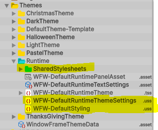
- The Runtime Stylesheet containes links to the Default unity theme and style sheets which contain the settings and style application code.
(Default Style Settings and Application files are provided in the Window Framework Runtime Theme Folder).
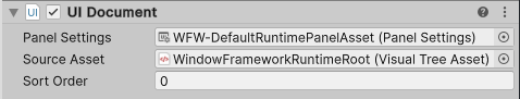
The UI Document Component
-
Panel Settings
The Panel settings asset is a required item that setup links to default stylesheets along with many other settings.
See the Panel Settings Asset section lower in the page -
Source Asset
The source asset for the WIndowFramework is simply a blank UXML document that serves as a root for the display. We have included one for you but any blank document will work.
-
Sort Order
When using multiple layers (panels) then you may have to adjust this setting to get the render order correct. Higher numbers are rendered in front.
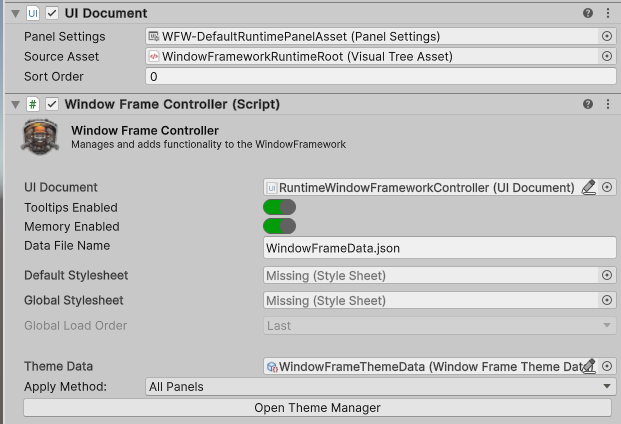
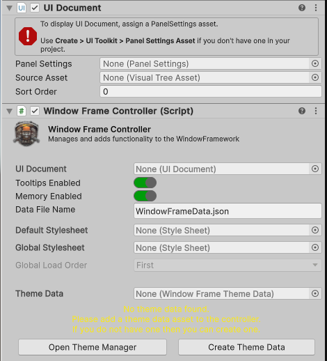
The Window Frame Controller
Default Settings (from prefab)
No Settings
-
UI Document (optional)
The controller will attempt to find the attached UI document component as it is a required component, however it is also available here for manual assignment in case you have issues with scene changes.
-
Runtime Tooltips Enabled/Disabled
When checked this option will Enable tooltips for window frame elements, including content. Tooltips will be auto assigned, all you have to do is specify some text in the element tooltip filed and the system will do the rest.
Tooltips are auto applied on creation but must be applied to instatiated content withWindowFrameController.Instance.ApplyTooltips(doc_root); -
Window Memory Enabled/Disabled
When checked this option will Enable window and settings memory.
Individual windows will still need to be set withWindowMemoryEnabled=trueand must be a dedicated type. -
Save Data File Name
Filename for the settings memory, stored in the projects persistent data folder.
-
Default USS Style sheet
The default stylesheet is used when no theme data is available, that is the only time that this file is every called and can safely be ignored, however it is useful in dev builds that have changing file structures as you can make an error theme to offer quick obvious feedback on any problems. This is also a perfectly viable choice for a single theme project and can be a assigned to a Theme Stylesheet or Standard Stylesheet.
This is a perfectly viable choice for a single theme project and can be a assigned to a Theme Stylesheet or Standard Stylesheet. -
Global Theme or Style Sheet
The Global Stylesheet can also be a Stylesheet (USS) OR a Unity Theme Stylesheet (TSS) asset, all Global stylesheets / theme files should be kept in a Resources folder, our default recommended location is
This recommended theme folder is also where we sugest you save any custom themes you make so that asset updates do not effect your project.Assets/Resources/[Your-Project-Name]/Themes/Globalbut any resources that fits your project structure will work. -
Global Load Order
This setting allows you to set a shared ThemeStylesheet or standard Stylesheet to load first or last.
In the USS system applies in a cascading format, this means that the order in which you load your files matter. -
USS Theme Data
Theme data is stored as a serializable scriptable object so everything is placed into your build. The currently active theme is handled by the memory system allowing reset to the default theme at any time.
And some small print. -
Theme Application Method
Themes can be applied to Windows, The Panel assigned to the controller, or All active panels in the scene. When the system applies the style sheets from the theme it removes the sheets related to the previous theme.
This means that you can add additional stylesheets without the Window Framework Theme System effecting them.
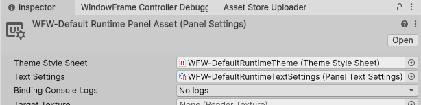
The Panel Settings Asset
The Panel Asset links the Panel component to the runtime stylesheets, along with many other options here we are focused on the stylesheet
-
Theme Stylesheet
The Runtime Theme needs to be attached here so that the base style commands for the Window Framework can be loaded. If you have an existing project with existing runtime theme you can just attach the WindowFramework Default Styling and Default Theme Settings to your existing runtime theme similar to ours as shown in the image below
Included Panel Settings Asset in Inspector
Included Runtime Stylesheet Links
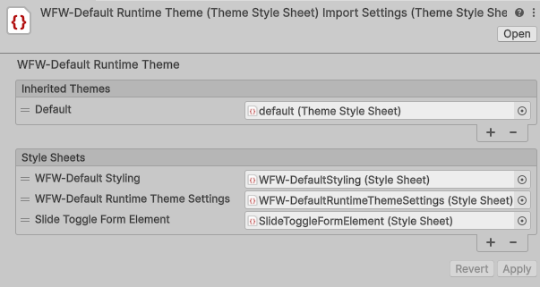
Files to copy when using your own Runtime Stylesheet