Window Framework Tooltip Use and Styling
The Framework has a built in tooltips manager that works all all Visual Elements in your UI
Tooltip Manipulator Overview
The Tooltip manipulator adds floating tooltips to the runtime user interface by looking for all visual elements and checking them for a tooltip value. The tooltip value can be assigned to any visual element in UI toolkit through code with element.tooltip="my helpful tooltip"; or in UI Builder from the Inspector panel and is a simple string value. The tooltip visual element structure is stored in the WindowFrameController as an accessible value that you can manipulate like any standard visual element. This means that you can reformat the tooltip display layout on the fly (if desired) at runtime to suit the needs of the display. The tooltips also use USS styling that are apart of the standard WindowFramework Theme System and uses USS Variables to make changes convenient.
Applying Tooltips to Elements
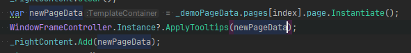
When a window is created it scans itself and applies tooltip manipulators to all existing elements with tooltip data before the window is even displayed, this also extends to applying content to a window. So if you have an existing window and change the Content of the window the tooltips will reapply automatically. BUT, if you are instantiating new elements within the Content section of a window AFTER CREATION then you will need to apply tooltips when the item is added as shown in this C# code snippet from our included demo.
Applying tooltips to Multiple Panels
The tooltips, like the themes, can be applied to multiple panels if you like. When the WindowFrameController theme system is set to ApplyToAllPanels you can use WindowFrameController.Instance.ApplyTooltips(); by leaving the root empty the manager will use the theme controller settings and apply the tooltips to panels accordingly. This is extremely helpful for multi-panel systems such as those using World Space UI components
Runtime Settings and Options
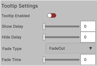
At runtime the tooltip manager offers several settings for player customization
-
Tooltips Enabled
Turn On or Off Tooltips
Enable or Disable the tooltip system -
Show Delay
Time in seconds that the pointer must hover over an element before the tooltip will be rendered
This time must expire BEFORE any fade in animations can start -
Hide Delay
Time in seconds that the tooltips stay on screen before being removed.
This time must expire BEFORE any fade out animations can start -
Fade Type
There are 4 available Fade Types: Fade In, Fade Out, Fade In and Out, None with each doing exactly what they say.
Setting to None will ignore fade time values, while still respecting show and fade delays. -
Fade Time
Time it takes (in seconds) for the tooltip to fade (in or out)
Ignored when FadeType is set to None
This form is a Custom Control that can be used from code using:new TooltipSettingsFormElement()
or placed into UXML Documents with UI Builder
Tooltip Theming and Styling Options
The Tooltip system has built in styling options that you can use or over wright in your own stylesheets. The Named areas, Classes and USS Variable names are listed in the source code below for reference and are all included in the WindowFramework Default Theme Template.
-
Named Area
- #Tooltip
- #TooltipLabel
- #TooltipSettingsForm
- #TooltipSettingsFormTitle
- #TooltipsEnabledToggle
- #TooltipShowDelaySlider
- #TooltipHideDelaySlider
- #TooltipFadeType
- #ToolTipFadeTimeSlider
-
Style Classes
- .tooltip
- .tooltip__label
- .tooltip__settings-form
- .tooltip__settings-form-title-label
- .form__slider-element
- .form__label-element
- .form__enum-element