Build a UI your players can arrange—and make their own.
WindowFramework brings desktop-style windows, visual theme authoring, and player-editable themes to Unity UI Toolkit. Use it as the windowing layer around your own interface, choose the behavior your application needs, and decide how much appearance customization to offer your players.
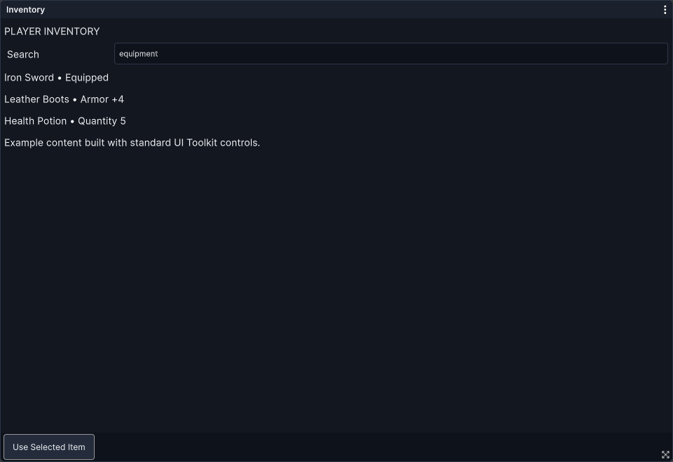
Windows That Fit Your Application
Give inventory screens, settings panels, tools, and other interfaces a consistent window structure without building the window frame for each one.
- Create through C# or UXML. Use WindowFrame directly or extend it with your own UI Toolkit content.
- Compose your layout. Configure a title and header, supply the main content, and add an optional footer toolbar.
- Move and resize. Drag windows by their headers and resize from edges and corners, with configurable minimum and maximum dimensions.
- Choose the behavior. Allow or restrict moving, resizing, closing, locking, fullscreen behavior, and multiple instances.
- Control placement and visibility. Choose from nine starting positions and show, hide, close, or activate windows through the framework.
Snapping, Docking, and Tabbed Windows
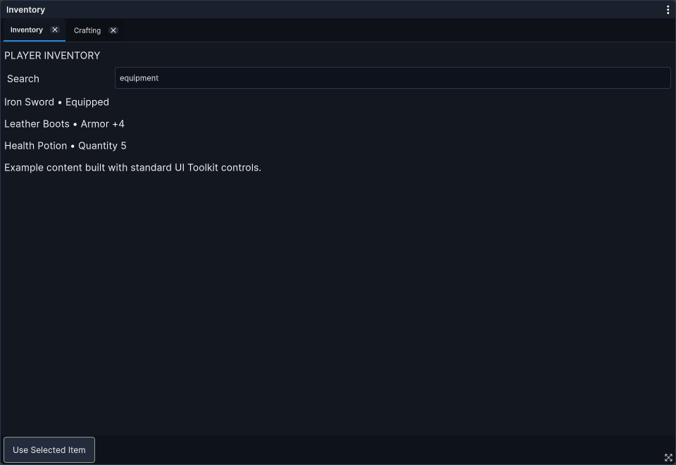
Let players organize several windows into a layout that suits how they use your application.
- Magnetic snapping. Align windows with screen edges or neighboring windows, with an adjustable snap distance.
- Screen-edge docking. Arrange windows in left, right, top, or bottom halves, or maximize them within their windowing area.
- Tabbed groups. Combine windows into a shared frame, switch between their content, and detach tabs back into standalone windows.
Snapping and docking preferences can be configured through the supplied runtime settings. Per-window permissions let you keep particular interfaces fixed when your design requires it.
Window Memory and Preferences
Keep useful layouts and choices between sessions rather than asking players to arrange everything again.
- Saved window state. Identified windows can retain their layout and state through the framework's persistence system.
- Selective participation. You control memory enablement on the controller and choose which windows participate.
- Saved preferences. Retain theme selection and supported window, tooltip, and context-menu preferences.
Window memory is a developer-controlled feature. Player themes and preference resets do not enable or disable the controller's memory policy.
Tooltips, Context Menus, and Modals
Support the interactions around your windows as well as the windows themselves.
- Tooltips. Add contextual help with configurable show delays and fade behavior.
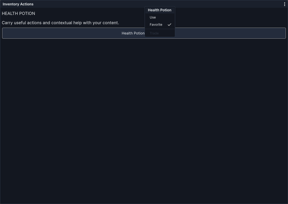
- Context menus. Present actions with optional titles, separators, checked options, and disabled items.
- Modal dialogs. Present WindowFrame dialogs through the controller, with focus management and queued presentation.
- Modal cards. Use card-based content and actions within the same modal system.
- Runtime settings. Use the supplied settings window for theme selection, window behavior, tooltips, and context menus.
You supply the content and application actions. Modal dismissal rules and gameplay input handling remain under your application's control.
Theme Studio and Theme Management
Create a consistent appearance for your interface, then offer different looks without rebuilding its content.
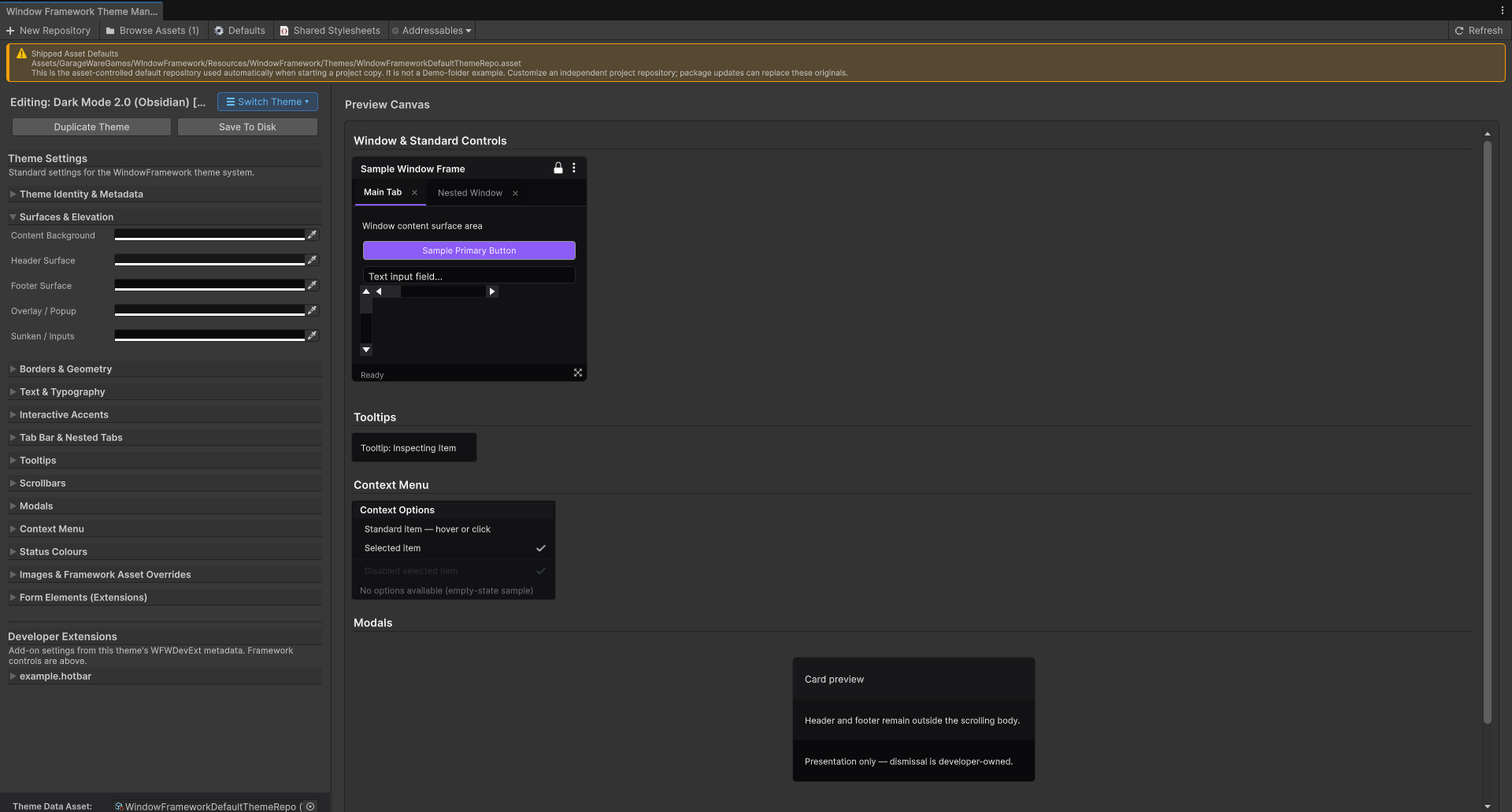
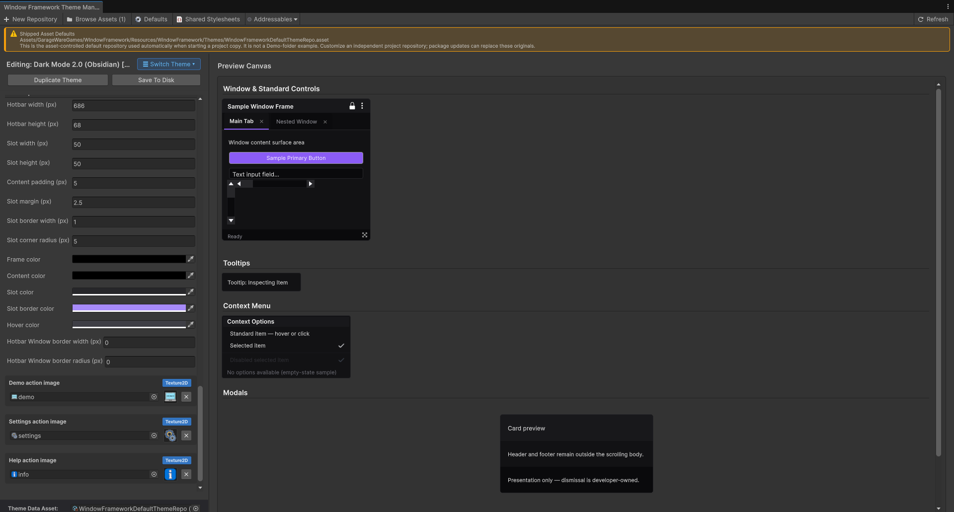
- Visual authoring. Edit supported theme settings in Theme Studio and see changes in its framework preview.
- Coordinated appearance. Customize colors, typography, borders, geometry, tabs, scrollbars, modal presentation, context menus, status colors, and slide toggles.
- Your artwork. Configure supported backgrounds, icons, fonts, and cursor references.
- Theme workflows. Create new themes, duplicate existing themes, and switch configured themes at runtime.
- Project-owned repositories. Use guided setup to create a theme repository for your project, with its UI configuration and copied repository content.
- Legacy upgrade. Create a separate 2.0 upgrade from a selected legacy theme source. This is a theme upgrade workflow, not automatic conversion of every custom USS layout.
See Theme Studio and Manager for theme-authoring workflows.
Player Themes — Let Players Make It Their Own
Offer appearance customization that works outside the Unity Editor. Player Themes let your players create editable copies of supplied themes, change supported settings in external theme files, and select their personalized look in your application.
- Editable theme copies. Give players a starting point based on a supplied theme instead of requiring them to build a theme from scratch.
- Appearance customization. Let players edit supported numeric and color values and use supported images in their theme files.
- Refresh and select. Reload player themes after edits and apply them through the runtime theme-selection workflow.
- Remember their choice. Retain the selected theme through the framework's existing persistence system.
- Include your custom UI. Developer Extensions make your declared application-specific settings available to player themes alongside the standard framework settings.
Useful issue reports. Report unsupported or invalid settings so players can identify what needs attention.
You choose the customization boundaries.** Player themes use application-defined settings, numeric bounds, configured fonts, and supported application targets. They do not execute player-supplied code or arbitrary USS stylesheets, and editable copies are not unrestricted copies of every styling rule.
Player Themes are optional: enable them when player customization fits your application.
See Player Themes for configuration and player-theme workflows.
Developer Extensions — Extend Player Customization
Bring your own UI into the player-theme system. Developer Extensions let you expose supported appearance settings for your custom controls, giving players more customization options beyond the standard WindowFramework settings.
- Choose what players can change. Declare custom numeric, color, and image settings through USS metadata.
- Author in Theme Studio. Declared settings appear automatically in the Developer Extensions area.
- Include settings in player themes. The same declarations supply the settings and defaults used by editable player-theme copies.
- Connect choices to your interface. Supported variable mappings apply those settings to your custom UI.
Keep control of the limits. Define the available settings and numeric bounds; application targets come from your prepared styling, not player files.
Developer Extensions power the custom-UI side of Player Themes.** Define supported settings, author them in Studio, and make them available for player customization. This extends appearance customization; it does not provide arbitrary gameplay modding or support every USS property and selector.
See Developer Extensions for declaring and using custom settings.
Visual Scripting Integration
Control framework windows from Unity Visual Scripting graphs. Supplied window-control nodes include showing and hiding existing windows, allowing graph-driven behavior to work with your window interface.
Preview feature:** the integration is currently marked experimental/preview. It requires Unity Visual Scripting; node signatures and APIs may change as the integration develops.
Additional Controls and Loading Options
- Reusable slide toggle. Use the supplied UI Toolkit boolean field from C# or UXML, with appearance provided by your configured styles.
- Optional Addressables loading. Load configured theme data through the framework's Addressables integration when that integration is enabled and set up.
