Help users understand a control, discover the actions available for an item, or give a decision their full attention. WindowFramework provides tooltips, context menus, and modal presentation alongside its ordinary windows, so those interactions can share your application's configured appearance.
You supply the meaningful content and actions. The framework presents the interface; it does not decide whether an item can be traded, a form is valid, or a player should receive a reward.
Before You Begin
Complete Installation and Setup and keep the intended controller and UI document active. If you have not created your window content yet, follow Windows and Layout first.
Install tooltip behavior after controller initialization. Present modal content only when the controller's root is attached to a panel. These workflows do not create a missing controller or wait indefinitely for an unavailable document.
1. Add Contextual Help With Tooltips
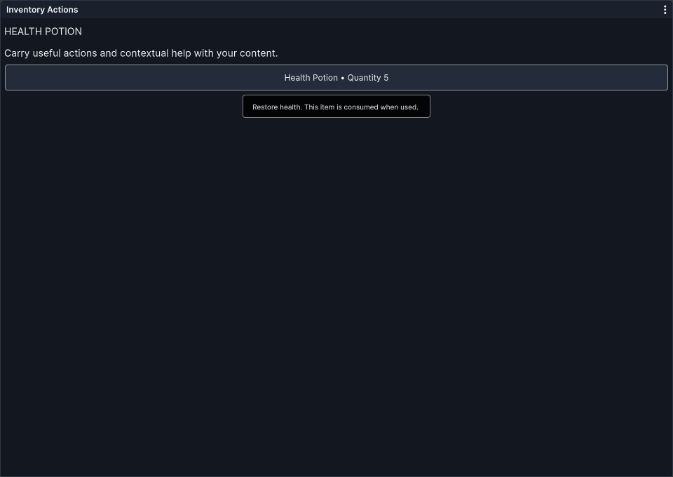
Use the Standard Tooltip Property
Set the UI Toolkit tooltip property on the element that needs help:
The equivalent UXML control is:
This is a control fragment to place inside your UXML content, not a complete document. WindowFrameTooltip is controller-managed and is not itself registered as a UXML element; do not add a tooltip display object beside every button.
Apply Behavior to New Content
The framework applies tooltip behavior through its existing window/root setup paths. When you add content dynamically after those paths have run, call the subtree overload after the new controls and their tooltip text exist:
Prefer the known subtree rather than rescanning unrelated UI. ApplyTooltips requires an initialized controller and enabled tooltips. It uses element userData as an installation marker, so keep application metadata elsewhere on controls using this automatic installation path. Do not clear or replace that marker merely to refresh text.
For a manually owned manipulator, retain the instance so your application can remove it explicitly:
Choose automatic installation or your own installation policy for the same element, not both. A TooltipManipulator captures the tooltip service available when constructed; creating it before the controller is ready does not make it connect automatically later.
Placement Hints
Prefix the text with a direction hint when a preferred side makes the help easier to read:
- T: above the target, the default direction.
- B: below the target.
- L: to the left.
- R: to the right.
For example, tooltip = "B:Open the selected item's details." requests bottom placement. The prefix is removed from the displayed message. Positioning also accounts for available bounds, so the preferred side is not a promise that the tooltip can extend outside the visible area.
Timing, Fades, and Interaction
Use the supplied runtime settings to configure tooltip enablement, show delay, and supported fade behavior. The fade options are None, FadeIn, FadeOut, and FadeInAndOut. Repository defaults provide the starting settings; saved preferences may supply the current values.
Hovering is not the only factor: pointer movement, clicks, capture, dragging, and target removal can cancel or hide a tooltip. Test help text with the actual controls rather than expecting an identical delay during every pointer interaction.
Tooltips are informational and ignore pointer picking. Put important actions in real controls, not in a tooltip. For advanced application-owned display, the controller's tooltip service exposes Show(target), Close(), and CloseNow(); the normal hover workflow is the simpler starting point.
2. Put Item Actions in a Context Menu
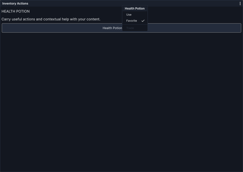
Define the Available Actions
Create a ContextMenuConfig and populate its ordered Items list. The following method-body example assumes your application supplies UseItem and TradeItem action methods:
- Title is optional; an empty title omits the heading.
- IsVisible determines whether a row is included. A null visibility predicate means visible.
- IsDisabled returns true to disable a visible action. It is not an enabled predicate.
- IsChecked supplies the checkmark state.
- A parameterless ContextMenuItem creates a separator.
The simple label/action constructor supplies usable default state predicates. If you use a more detailed overload or replace predicates, keep IsDisabled and IsChecked nonnull for visible nonseparator rows. Keep the Items list and its entries valid as well.
Predicates are evaluated when the menu is built. Changing the underlying model while it is open does not continuously rebuild its rows; reopen when a fresh state snapshot is needed. Use real application state rather than the local demonstration booleans above in your finished interface.
A disabled or hidden option is presentation, not authorization. Validate the operation again inside your application action, especially if its underlying data can change after the menu opens.
Attach the Trigger
Attach a ContextMenuActivator to the target control:
The default trigger is a single right-click. The constructor also accepts clickCount and button, such as button: UnityEngine.UIElements.MouseButton.LeftMouse for an application-designed alternative. It handles NavigationSubmitEvent as another activation route when your input and focus setup supplies that event.
Choose the trigger deliberately. A left-click context menu attached to a Button may replace the simple action users expect from clicking that control. This does not automatically provide every touch, keyboard, or controller-navigation pattern your application needs.
Keep the manipulator reference if you later remove the behavior:
Removing a visual element from its panel is not the same as explicitly removing its manipulator. Your application still owns callbacks and data captured in the configuration.
Manual Display and Dismissal
For a presentation you control directly, create a fresh menu with a valid attached target:
The current menu layout anchors to target geometry. The position argument is retained by the API but is not used as a free-position layout command, so do not assume this overload creates a cursor-positioned menu anywhere on screen.
An enabled item executes its action and removes the menu. Outside pointer presses and navigation cancellation also dismiss it; leaving the menu can start the configured fade-out behavior. The optional onClose argument to Show is invoked after successful item activation, not for every kind of dismissal. Use it only for that purpose.
The configuration represents one ordered menu; it does not include an automatic submenu builder. Add application-specific grouping with titles and separators, or design a separate interface for more complex choices.
During an active modal, background targets cannot use these overlays to bypass the modal ownership policy. Menus and tooltips associated with eligible modal content use the framework's overlay route.
3. Present a Window as a Modal Dialog
A modal asks users to deal with the presented interface before returning to other controls in the controller's windowing document. Construct detached content and let the controller own presentation rather than manually adding a dim background behind an ordinary window.
Use ShowModal for WindowFrame Dialogs
This example presents a confirmation window. ApplyChanges is your application method:
The controller must be active and its root attached. Pass a detached WindowFrame; do not first call AddElement and then attempt to transfer the mounted window into modal ownership. The optional initial-focus control must belong to the dialog.
For a WindowFrame dialog, dismissOnBackdrop defaults to false. If enabled, clicking the backdrop requests normal closure, which still respects AllowClose and Locked. Decide whether an outside click is appropriate for the interaction you are designing.
The host presents one active modal WindowFrame at a time. Further modal-window requests wait in FIFO order instead of appearing as an independently interactive pile of windows. Closing or hiding the active presentation releases its ownership and allows the next request to proceed.
4. Use Cards for Forms and Queued Prompts
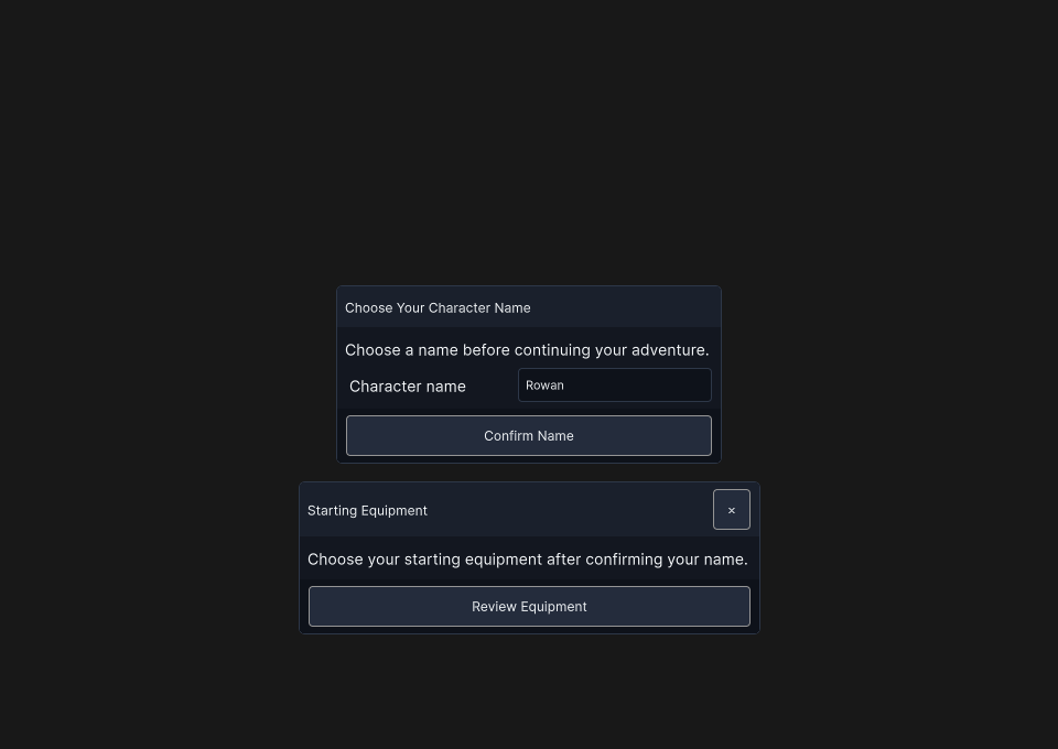
A CardElement is content, not a separate window. It has a fixed header and footer with a scrolling body, but no independent dragger, resizer, fullscreen state, or layout-memory identity. WindowModal supplies the surrounding card-queue presentation.
Present a Required Form
For a must-answer form, disable user dismissal and provide an explicit validated completion action:
TrySaveName represents your application's validation and save operation, returning true only when completion is allowed. Supply suitable error feedback instead of leaving users to guess why a form remains open. If completion is asynchronous, coordinate duplicate submissions and control state in your application before removing the card.
Author card sizing in your own USS rather than treating it as a WindowFrame:
The modal constrains the card to its available viewport. Test long content and narrow screens so the body remains accessible while the header and actions stay useful.
User Dismissal Is Not Application Completion
Card dismissal has separate controls:
- AllowDismiss permits user dismissal requests.
- ShowCloseButton controls the close affordance's visibility.
- AllowOutsideDismiss permits an outside-click request, subject to AllowDismiss.
Hiding the close button alone does not prohibit outside dismissal. For optional content, a user-facing Cancel action can call card.RequestDismiss(). A required card rejects that request when AllowDismiss is false.
After your application has completed an authorized operation, controller.RemoveModalCard(card) removes that exact card even if user dismissal is prohibited. Its true return value means removal started, not that the fade completed or the business operation succeeded. Validate first, then remove.
Queue and Content Ownership
Calling ShowModal with another detached CardElement adds it to an active WindowModal, or creates a new WindowModal presentation when needed. If an ordinary modal window is active, the new card presentation follows the modal-window queue.
WindowModal retains each card's slot during its closing fade, then reflows the remaining queue. Main content interaction and focus follow the active eligible card; dismissal controls are governed by each card's own permissions. Do not independently detach a card from a DismissRequested callback while its owner is carrying out the transition.
Retain references to each card and populate its actual Body and Footer. WindowModal's ModalBody, ModalHeader, and ModalFooter aliases refer to its initial compatibility card, not whichever explicit queued card happens to be active. They are not a substitute for the reference returned by your own card construction.
For an application-owned WindowModal, AddCard(card, initialFocus) and RemoveCard(card) provide the same card-level workflow. Populate a detached card before adding it. A first explicit card replaces the unused empty compatibility card, so the queue need not start with a blank prompt.
5. Coordinate Focus, Input, and Cancellation
The modal host guards interaction within its linked windowing root and routes focus toward the active presentation. When released, it restores a valid launching focus where possible. This does not globally disable all Unity UI or pause the application.
- Keep the windowing document sorted above application UI where its presentation must be visible.
- Coordinate gameplay InputActions and shortcuts through your existing input architecture.
- Manage independent UI documents explicitly. All Panels is a styling scope, not a promise of cross-document modal input blocking.
Do not assume that showing a modal pauses simulation or authorizes a gameplay action.
No automatic Escape binding is installed for modal dismissal.** If your input setup supplies NavigationCancelEvent, an optional card can handle it locally:
This uses the card's user-dismissal permission; it does not force-close a required form. Decide whether cancellation is appropriate and route any separate gameplay cancel action consistently.
6. Close and Clean Up Deliberately
Use the narrow operation matching your intention:
- dialog.CloseWindow(): ordinary WindowFrame closure, respecting its normal permissions.
- card.RequestDismiss(): user cancellation request, respecting AllowDismiss.
- RemoveModalCard(card): application-authorized removal of the exact card in the active WindowModal.
- CloseActiveModal(): application-authorized closure of the active dialog or active card.
- CloseAllModals(): discard pending presentations and tear down the active modal presentation.
- CancelPendingModal(window): remove an exact queued WindowFrame request before it is shown.
The controller's application-authorized closing methods bypass user-dismissal restrictions. Do not attach CloseActiveModal unconditionally to a cancel shortcut while a required-answer form must stay open.
None of these methods submits data, grants rewards, or runs your business cancellation policy automatically. Release application event subscriptions, leased assets, and pending operations according to their owners. Keep callback and card/window references when you need precise cleanup; removing one prompt should not inadvertently complete another.
Check the Interaction in Your Application
- Hover with tooltips enabled; test hints near edges, pointer movement, dragging, and removed targets.
- Open context menus with the intended input route. Confirm visible, disabled, and checked states match current data and action callbacks revalidate their operation.
- Open a modal and check initial focus, navigation, document sorting, and interaction with your gameplay input.
- Queue more than one request and verify the intended window/card order.
- Try the close button, outside clicks, and configured cancellation route on both optional and required content.
- Validate a required form, then remove its exact card and check the remaining queue and focus.
- Close the presentation and confirm external application resources and subscriptions are handled correctly.
Continue to Theme Studio and Manager to author the appearance of these interfaces. Built-in Styling Class Reference will provide the built-in class reference, while Troubleshooting is the place for setup and configuration problems.
