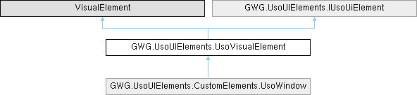
A custom visual element container that extends Unity's VisualElement with USO UI framework functionality. Provides enhanced styling, field validation, data binding capabilities, and integration with the USO UI system for general-purpose container and layout scenarios. More...
Public Member Functions | |
| UsoVisualElement () | |
| Initializes a new instance of the UsoVisualElement class with default settings. Creates a visual element container with USO framework integration enabled and field status functionality disabled by default. | |
| UsoVisualElement (string fieldName) | |
| Initializes a new instance of the UsoVisualElement class with the specified field name. Creates a visual element container with custom identification for binding and reference purposes. | |
| UsoVisualElement (string fieldName, out UsoVisualElement newField) | |
| Initializes a new instance of the UsoVisualElement class with field name and returns a reference. Creates a visual element container with custom identification and provides an out parameter for immediate access. | |
| void | ApplyBinding (string fieldBindingProp, string fieldBindingPath, BindingMode fieldBindingMode) |
| Applies data binding to the specified property of this control using Unity's data binding system. Configures the binding with the provided path and mode for automatic data synchronization. | |
| UsoLineItem | GetParentLineItem () |
| Retrieves the first ancestor UsoLineItem control in the visual tree hierarchy. This is useful for accessing parent container functionality and maintaining proper UI structure. | |
| void | InitElement (string fieldName=null) |
| Initializes the USO UI element with the specified field name and applies necessary styling classes. This method sets up the basic USO framework integration for the control. | |
| void | SetFieldStatus (FieldStatusTypes fieldStatus) |
| Updates the field's status type, which affects its visual appearance and validation state. The status change is automatically reflected in the UI through the FieldStatus property. | |
| void | ShowFieldStatus (bool status) |
| Controls the visibility and functionality of the field status/validation system. When disabled, removes validation-related styling from the control. | |
| Public Member Functions inherited from GWG.UsoUIElements.IUsoUiElement | |
| void | AddToClassList (string className) |
| Adds the specified CSS class name to this element's class list. This method is inherited from Unity's VisualElement and enables dynamic styling modifications. | |
| void | ClearBindings () |
| Removes all data binding configurations from this element. This method is inherited from Unity's VisualElement and provides cleanup functionality for data bindings. | |
| void | RemoveFromClassList (string className) |
| Removes the specified CSS class name from this element's class list. This method is inherited from Unity's VisualElement and provides dynamic styling capabilities. | |
Properties | |
| FieldStatusTypes | FieldStatus [get, private set] |
| Gets the current field status type, which determines the visual state and validation feedback. This property is automatically reflected in the UI through CSS class modifications. | |
| bool | FieldStatusEnabled [get, private set] |
| Gets or sets whether field status/validation functionality is enabled for this control. When enabled, adds validation CSS class for styling. When disabled, removes validation styling. | |
Private Attributes | |
| FieldStatusTypes | _fieldStatus |
| bool | _fieldStatusEnabled = false |
Static Private Attributes | |
| const string | DefaultBindProp = "" |
| Default binding property used when applying data bindings to this field. Currently set to empty string as visual elements typically don't have a primary bindable value property. | |
| const string | ElementClass = "uso-visual-element" |
| CSS class name applied to all UsoVisualElement instances for styling purposes. | |
| const string | ElementValidationClass = "uso-field-validation" |
| CSS class name applied when field validation/status functionality is enabled. | |
Detailed Description
A custom visual element container that extends Unity's VisualElement with USO UI framework functionality. Provides enhanced styling, field validation, data binding capabilities, and integration with the USO UI system for general-purpose container and layout scenarios.
This control implements the IUsoUiElement interface to provide consistent behavior across the USO UI framework. It supports field status indicators, automatic data binding capabilities, and custom styling through CSS classes. The control serves as a foundational container element within the USO framework, suitable for layouts, grouping content, and creating custom composite controls. Unlike other USO controls, this element has field status functionality disabled by default, making it ideal for structural and organizational purposes where validation feedback is not required. The control provides a flexible foundation for building more complex UI components and can serve as a parent container for other USO elements while maintaining framework consistency and integration capabilities.
Constructor & Destructor Documentation
◆ UsoVisualElement() [1/3]
| GWG.UsoUIElements.UsoVisualElement.UsoVisualElement | ( | ) |
Initializes a new instance of the UsoVisualElement class with default settings. Creates a visual element container with USO framework integration enabled and field status functionality disabled by default.
◆ UsoVisualElement() [2/3]
| GWG.UsoUIElements.UsoVisualElement.UsoVisualElement | ( | string | fieldName | ) |
Initializes a new instance of the UsoVisualElement class with the specified field name. Creates a visual element container with custom identification for binding and reference purposes.
- Parameters
-
fieldName The name to assign to this visual element.
◆ UsoVisualElement() [3/3]
| GWG.UsoUIElements.UsoVisualElement.UsoVisualElement | ( | string | fieldName, |
| out UsoVisualElement | newField ) |
Initializes a new instance of the UsoVisualElement class with field name and returns a reference. Creates a visual element container with custom identification and provides an out parameter for immediate access.
- Parameters
-
fieldName The name to assign to this visual element. newField Output parameter that receives a reference to the newly created visual element.
Member Function Documentation
◆ ApplyBinding()
| void GWG.UsoUIElements.UsoVisualElement.ApplyBinding | ( | string | fieldBindingProp, |
| string | fieldBindingPath, | ||
| BindingMode | fieldBindingMode ) |
Applies data binding to the specified property of this control using Unity's data binding system. Configures the binding with the provided path and mode for automatic data synchronization.
- Parameters
-
fieldBindingProp The property name on this control to bind to. fieldBindingPath The path to the data source property to bind from. fieldBindingMode The binding mode that determines how data flows between source and target.
- Exceptions
-
Exception Thrown when binding setup fails. Original exception is preserved and re-thrown.
While visual elements don't typically have primary value properties for binding, this method enables binding to style properties, visibility states, or other visual element characteristics as needed.
Implements GWG.UsoUIElements.IUsoUiElement.
◆ GetParentLineItem()
| UsoLineItem GWG.UsoUIElements.UsoVisualElement.GetParentLineItem | ( | ) |
Retrieves the first ancestor UsoLineItem control in the visual tree hierarchy. This is useful for accessing parent container functionality and maintaining proper UI structure.
- Returns
- The parent UsoLineItem if found; otherwise, null.
◆ InitElement()
| void GWG.UsoUIElements.UsoVisualElement.InitElement | ( | string | fieldName = null | ) |
Initializes the USO UI element with the specified field name and applies necessary styling classes. This method sets up the basic USO framework integration for the control.
- Parameters
-
fieldName Optional name to assign to the element. If null, no name is set.
Implements GWG.UsoUIElements.IUsoUiElement.
◆ SetFieldStatus()
| void GWG.UsoUIElements.UsoVisualElement.SetFieldStatus | ( | FieldStatusTypes | fieldStatus | ) |
Updates the field's status type, which affects its visual appearance and validation state. The status change is automatically reflected in the UI through the FieldStatus property.
- Parameters
-
fieldStatus The new field status type to apply.
Implements GWG.UsoUIElements.IUsoUiElement.
◆ ShowFieldStatus()
| void GWG.UsoUIElements.UsoVisualElement.ShowFieldStatus | ( | bool | status | ) |
Controls the visibility and functionality of the field status/validation system. When disabled, removes validation-related styling from the control.
- Parameters
-
status True to enable field status functionality; false to disable it.
Implements GWG.UsoUIElements.IUsoUiElement.
Member Data Documentation
◆ _fieldStatus
|
private |
◆ _fieldStatusEnabled
|
private |
◆ DefaultBindProp
|
staticprivate |
Default binding property used when applying data bindings to this field. Currently set to empty string as visual elements typically don't have a primary bindable value property.
◆ ElementClass
|
staticprivate |
CSS class name applied to all UsoVisualElement instances for styling purposes.
◆ ElementValidationClass
|
staticprivate |
CSS class name applied when field validation/status functionality is enabled.
Property Documentation
◆ FieldStatus
|
getprivate set |
Gets the current field status type, which determines the visual state and validation feedback. This property is automatically reflected in the UI through CSS class modifications.
The current FieldStatusTypes value indicating the field's validation state.
Implements GWG.UsoUIElements.IUsoUiElement.
◆ FieldStatusEnabled
|
getprivate set |
Gets or sets whether field status/validation functionality is enabled for this control. When enabled, adds validation CSS class for styling. When disabled, removes validation styling.
True if field status functionality is enabled; otherwise, false. Default is false for visual elements.
Unlike other USO controls, UsoVisualElement has field status functionality disabled by default since it primarily serves as a container and structural element rather than an input control.
Implements GWG.UsoUIElements.IUsoUiElement.