Defines the contract for all USO UI framework elements, providing a standardized interface for field validation, data binding, styling, and framework integration capabilities. More...
Public Member Functions | |
| void | AddToClassList (string className) |
| Adds the specified CSS class name to this element's class list. This method is inherited from Unity's VisualElement and enables dynamic styling modifications. | |
| void | ApplyBinding (string fieldBindingProp, string fieldBindingPath, BindingMode fieldBindingMode) |
| Applies data binding configuration to the specified property of this element using Unity's data binding system. Enables automatic synchronization between the UI element and data source properties. | |
| void | ClearBindings () |
| Removes all data binding configurations from this element. This method is inherited from Unity's VisualElement and provides cleanup functionality for data bindings. | |
| void | InitElement (string fieldName) |
| Initializes the USO UI element with the specified field name and applies framework-specific configuration. Sets up the element for integration with the USO framework including styling, validation, and identification. | |
| void | RemoveFromClassList (string className) |
| Removes the specified CSS class name from this element's class list. This method is inherited from Unity's VisualElement and provides dynamic styling capabilities. | |
| void | SetFieldStatus (FieldStatusTypes fieldStatus) |
| Updates the element's field status type, which affects its visual appearance and validation state. The status change is typically reflected through CSS class modifications and visual indicators. | |
| void | ShowFieldStatus (bool status) |
| Controls the visibility and functionality of the field status/validation system for this element. When disabled, removes validation-related styling and status indicators from the element. | |
Properties | |
| FieldStatusTypes | FieldStatus [get] |
| Gets the current field status type, which determines the visual state and validation feedback of the element. The status type automatically influences the element's appearance through CSS class modifications. | |
| bool | FieldStatusEnabled [get] |
| Gets a value indicating whether field status/validation functionality is enabled for this element. When enabled, the element can display validation states and apply appropriate styling classes. | |
Detailed Description
Defines the contract for all USO UI framework elements, providing a standardized interface for field validation, data binding, styling, and framework integration capabilities.
This interface serves as the foundation for the USO UI framework, ensuring consistent behavior across all custom UI controls. It establishes common functionality including field status management, data binding capabilities, CSS class manipulation, and element initialization. All USO UI controls should implement this interface to maintain framework compatibility and provide users with a unified API for interaction and configuration. The interface supports various UI scenarios including form validation, dynamic styling, and automated data synchronization.
Member Function Documentation
◆ AddToClassList()
| void GWG.UsoUIElements.IUsoUiElement.AddToClassList | ( | string | className | ) |
Adds the specified CSS class name to this element's class list. This method is inherited from Unity's VisualElement and enables dynamic styling modifications.
- Parameters
-
className The CSS class name to add to the element.
This method enables runtime styling changes by adding CSS classes to elements. It's frequently used for applying validation states, themes, and conditional styling based on element state or user interaction.
◆ ApplyBinding()
| void GWG.UsoUIElements.IUsoUiElement.ApplyBinding | ( | string | fieldBindingProp, |
| string | fieldBindingPath, | ||
| BindingMode | fieldBindingMode ) |
Applies data binding configuration to the specified property of this element using Unity's data binding system. Enables automatic synchronization between the UI element and data source properties.
- Parameters
-
fieldBindingProp The name of the property on this element to bind to the data source. fieldBindingPath The property path in the data source to bind from. fieldBindingMode The binding mode that controls the direction and behavior of data flow.
This method provides a standardized way to establish data binding relationships across all USO UI elements. The default implementation is empty, allowing individual controls to override with specific binding logic. Binding modes typically include ToTarget (one-way to UI), ToSource (one-way from UI), and TwoWay (bidirectional).
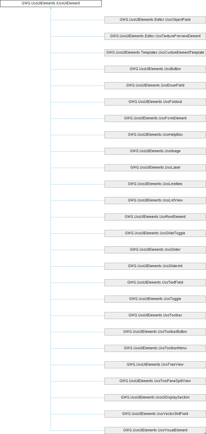
Implemented in GWG.UsoUIElements.UsoButton, GWG.UsoUIElements.UsoEnumField, GWG.UsoUIElements.UsoFoldout, GWG.UsoUIElements.UsoFormElement, GWG.UsoUIElements.UsoHelpBox, GWG.UsoUIElements.UsoImage, GWG.UsoUIElements.UsoLabel, GWG.UsoUIElements.UsoLineItem, GWG.UsoUIElements.UsoListView, GWG.UsoUIElements.UsoRowElement, GWG.UsoUIElements.UsoSlider, GWG.UsoUIElements.UsoSliderInt, GWG.UsoUIElements.UsoSlideToggle, GWG.UsoUIElements.UsoTextField, GWG.UsoUIElements.UsoToggle, GWG.UsoUIElements.UsoTreeView, GWG.UsoUIElements.UsoUiDisplaySection, GWG.UsoUIElements.UsoVector3IntField, GWG.UsoUIElements.UsoVisualElement, GWG.UsoUIElements.Editor.UsoObjectField, GWG.UsoUIElements.Editor.UsoTexturePreviewElement, and GWG.UsoUIElements.Templates.UsoCustomElementTemplate.
◆ ClearBindings()
| void GWG.UsoUIElements.IUsoUiElement.ClearBindings | ( | ) |
Removes all data binding configurations from this element. This method is inherited from Unity's VisualElement and provides cleanup functionality for data bindings.
This method is useful for cleaning up data binding relationships when elements are being disposed or when binding configurations need to be reset. It helps prevent memory leaks and ensures proper cleanup of binding resources in dynamic UI scenarios.
◆ InitElement()
| void GWG.UsoUIElements.IUsoUiElement.InitElement | ( | string | fieldName | ) |
Initializes the USO UI element with the specified field name and applies framework-specific configuration. Sets up the element for integration with the USO framework including styling, validation, and identification.
- Parameters
-
fieldName The name to assign to this element for identification and binding purposes.
This method serves as the primary initialization point for USO framework integration. It typically includes setting the element name, applying CSS classes, configuring field status functionality, and any other framework-specific setup required for proper operation. The default implementation is empty, allowing individual controls to provide their specific initialization logic.
Implemented in GWG.UsoUIElements.UsoButton, GWG.UsoUIElements.UsoEnumField, GWG.UsoUIElements.UsoFoldout, GWG.UsoUIElements.UsoFormElement, GWG.UsoUIElements.UsoHelpBox, GWG.UsoUIElements.UsoImage, GWG.UsoUIElements.UsoLabel, GWG.UsoUIElements.UsoLineItem, GWG.UsoUIElements.UsoListView, GWG.UsoUIElements.UsoRowElement, GWG.UsoUIElements.UsoSlider, GWG.UsoUIElements.UsoSliderInt, GWG.UsoUIElements.UsoSlideToggle, GWG.UsoUIElements.UsoTextField, GWG.UsoUIElements.UsoToggle, GWG.UsoUIElements.UsoToolbar, GWG.UsoUIElements.UsoToolbarButton, GWG.UsoUIElements.UsoToolbarMenu, GWG.UsoUIElements.UsoTreeView, GWG.UsoUIElements.UsoTwoPaneSplitView, GWG.UsoUIElements.UsoUiDisplaySection, GWG.UsoUIElements.UsoVector3IntField, GWG.UsoUIElements.UsoVisualElement, GWG.UsoUIElements.Editor.UsoObjectField, and GWG.UsoUIElements.Templates.UsoCustomElementTemplate.
◆ RemoveFromClassList()
| void GWG.UsoUIElements.IUsoUiElement.RemoveFromClassList | ( | string | className | ) |
Removes the specified CSS class name from this element's class list. This method is inherited from Unity's VisualElement and provides dynamic styling capabilities.
- Parameters
-
className The CSS class name to remove from the element.
This method allows runtime modification of element styling by removing CSS classes. It's commonly used in conjunction with field status changes and conditional styling scenarios.
◆ SetFieldStatus()
| void GWG.UsoUIElements.IUsoUiElement.SetFieldStatus | ( | FieldStatusTypes | fieldStatus | ) |
Updates the element's field status type, which affects its visual appearance and validation state. The status change is typically reflected through CSS class modifications and visual indicators.
- Parameters
-
fieldStatus The new FieldStatusTypes value to apply to this element.
This method provides a standardized way to update element validation states across the USO framework. Implementation typically involves updating the FieldStatus property and triggering appropriate visual changes through the UsoUiHelper.SetFieldStatus utility method.
Implemented in GWG.UsoUIElements.UsoButton, GWG.UsoUIElements.UsoEnumField, GWG.UsoUIElements.UsoFoldout, GWG.UsoUIElements.UsoFormElement, GWG.UsoUIElements.UsoHelpBox, GWG.UsoUIElements.UsoImage, GWG.UsoUIElements.UsoLabel, GWG.UsoUIElements.UsoLineItem, GWG.UsoUIElements.UsoListView, GWG.UsoUIElements.UsoRowElement, GWG.UsoUIElements.UsoSlider, GWG.UsoUIElements.UsoSliderInt, GWG.UsoUIElements.UsoSlideToggle, GWG.UsoUIElements.UsoTextField, GWG.UsoUIElements.UsoToggle, GWG.UsoUIElements.UsoToolbar, GWG.UsoUIElements.UsoToolbarButton, GWG.UsoUIElements.UsoToolbarMenu, GWG.UsoUIElements.UsoTreeView, GWG.UsoUIElements.UsoTwoPaneSplitView, GWG.UsoUIElements.UsoUiDisplaySection, GWG.UsoUIElements.UsoVector3IntField, GWG.UsoUIElements.UsoVisualElement, GWG.UsoUIElements.Editor.UsoObjectField, GWG.UsoUIElements.Editor.UsoTexturePreviewElement, and GWG.UsoUIElements.Templates.UsoCustomElementTemplate.
◆ ShowFieldStatus()
| void GWG.UsoUIElements.IUsoUiElement.ShowFieldStatus | ( | bool | status | ) |
Controls the visibility and functionality of the field status/validation system for this element. When disabled, removes validation-related styling and status indicators from the element.
- Parameters
-
status True to enable field status functionality; false to disable it.
This method allows dynamic control over whether an element participates in the validation system. When disabled, validation CSS classes are typically removed and status indicators are hidden, allowing elements to display in a neutral state without validation feedback.
Implemented in GWG.UsoUIElements.UsoButton, GWG.UsoUIElements.UsoEnumField, GWG.UsoUIElements.UsoFoldout, GWG.UsoUIElements.UsoFormElement, GWG.UsoUIElements.UsoHelpBox, GWG.UsoUIElements.UsoImage, GWG.UsoUIElements.UsoLabel, GWG.UsoUIElements.UsoLineItem, GWG.UsoUIElements.UsoListView, GWG.UsoUIElements.UsoRowElement, GWG.UsoUIElements.UsoSlider, GWG.UsoUIElements.UsoSliderInt, GWG.UsoUIElements.UsoSlideToggle, GWG.UsoUIElements.UsoTextField, GWG.UsoUIElements.UsoToggle, GWG.UsoUIElements.UsoToolbar, GWG.UsoUIElements.UsoToolbarButton, GWG.UsoUIElements.UsoToolbarMenu, GWG.UsoUIElements.UsoTreeView, GWG.UsoUIElements.UsoTwoPaneSplitView, GWG.UsoUIElements.UsoUiDisplaySection, GWG.UsoUIElements.UsoVector3IntField, GWG.UsoUIElements.UsoVisualElement, GWG.UsoUIElements.Editor.UsoObjectField, GWG.UsoUIElements.Editor.UsoTexturePreviewElement, and GWG.UsoUIElements.Templates.UsoCustomElementTemplate.
Property Documentation
◆ FieldStatus
|
get |
Gets the current field status type, which determines the visual state and validation feedback of the element. The status type automatically influences the element's appearance through CSS class modifications.
A FieldStatusTypes value indicating the current validation or display state.
This property reflects the element's current status in the validation system and triggers appropriate visual changes through the UsoUiHelper.SetFieldStatus method implementation.
Implemented in GWG.UsoUIElements.UsoButton, GWG.UsoUIElements.UsoEnumField, GWG.UsoUIElements.UsoFoldout, GWG.UsoUIElements.UsoFormElement, GWG.UsoUIElements.UsoHelpBox, GWG.UsoUIElements.UsoImage, GWG.UsoUIElements.UsoLabel, GWG.UsoUIElements.UsoLineItem, GWG.UsoUIElements.UsoListView, GWG.UsoUIElements.UsoRowElement, GWG.UsoUIElements.UsoSlider, GWG.UsoUIElements.UsoSliderInt, GWG.UsoUIElements.UsoSlideToggle, GWG.UsoUIElements.UsoTextField, GWG.UsoUIElements.UsoToggle, GWG.UsoUIElements.UsoToolbar, GWG.UsoUIElements.UsoToolbarButton, GWG.UsoUIElements.UsoToolbarMenu, GWG.UsoUIElements.UsoTreeView, GWG.UsoUIElements.UsoTwoPaneSplitView, GWG.UsoUIElements.UsoUiDisplaySection, GWG.UsoUIElements.UsoVector3IntField, GWG.UsoUIElements.UsoVisualElement, GWG.UsoUIElements.Editor.UsoObjectField, GWG.UsoUIElements.Editor.UsoTexturePreviewElement, and GWG.UsoUIElements.Templates.UsoCustomElementTemplate.
◆ FieldStatusEnabled
|
get |
Gets a value indicating whether field status/validation functionality is enabled for this element. When enabled, the element can display validation states and apply appropriate styling classes.
True if field status functionality is active; otherwise, false.
This property controls whether the element participates in the USO validation and status system. When disabled, validation-related CSS classes are removed and status indicators are hidden.
Implemented in GWG.UsoUIElements.UsoButton, GWG.UsoUIElements.UsoEnumField, GWG.UsoUIElements.UsoFoldout, GWG.UsoUIElements.UsoFormElement, GWG.UsoUIElements.UsoHelpBox, GWG.UsoUIElements.UsoImage, GWG.UsoUIElements.UsoLabel, GWG.UsoUIElements.UsoLineItem, GWG.UsoUIElements.UsoListView, GWG.UsoUIElements.UsoRowElement, GWG.UsoUIElements.UsoSlider, GWG.UsoUIElements.UsoSliderInt, GWG.UsoUIElements.UsoSlideToggle, GWG.UsoUIElements.UsoTextField, GWG.UsoUIElements.UsoToggle, GWG.UsoUIElements.UsoToolbar, GWG.UsoUIElements.UsoToolbarButton, GWG.UsoUIElements.UsoToolbarMenu, GWG.UsoUIElements.UsoTreeView, GWG.UsoUIElements.UsoTwoPaneSplitView, GWG.UsoUIElements.UsoUiDisplaySection, GWG.UsoUIElements.UsoVector3IntField, GWG.UsoUIElements.UsoVisualElement, GWG.UsoUIElements.Editor.UsoObjectField, GWG.UsoUIElements.Editor.UsoTexturePreviewElement, and GWG.UsoUIElements.Templates.UsoCustomElementTemplate.